de Velde
These winners are spreading their international wings
The fact that design talent from our regions is also active outside our country’s borders becomes clear when you look at the winners of the latest Henry van de Velde Awards. We polled six laureates about how they ended up on that foreign path, about the cultural differences they may or may not face and about the importance of an award in their own country.
Every year, the Henry van de Velde Awards honour the best Flemish designs of the past year. In addition to an award for Lifetime Achievement, Young Talent, Company, Ecodesign by OVAM and a Public Award, there are also 27 awards in nine categories. Out of more than 400 entries, a jury selected 27 winners, or three per category. Six of these projects are highly regarded not only nationally, but also internationally. For example, Digiphy by Granstudio and Silver by Create.eu are among the winners in the category Digital Product, The Icon Project by Kern02 and The Poster House Campaign by Klaas Verplancke in the category Graphics, The Exploded View by Biobased Creations/Stichting Nieuwe Helden in the category Design Research and the renovation of Muziekcentrum De Bijloke by DRDH Architects in the category Spaces.
The international course they take differs from project to project. Some compatriots set up their studio abroad, while others work from here for international clients.
Universal message
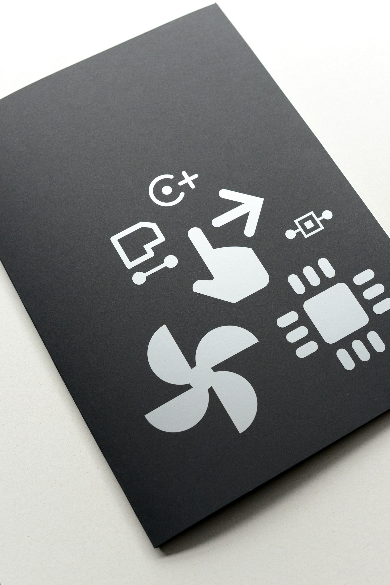
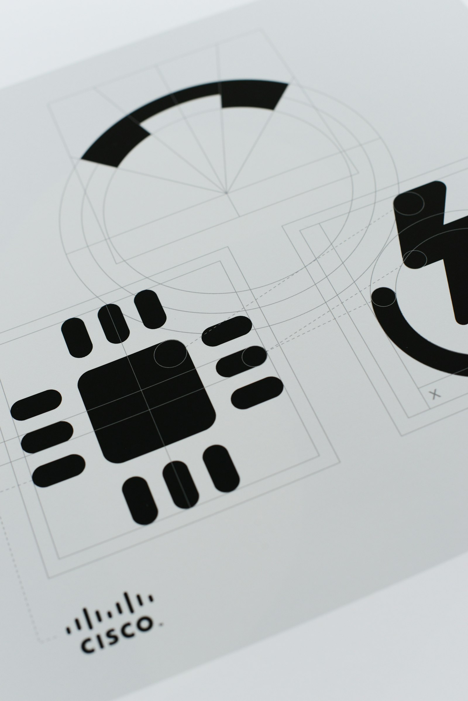
The Icon Project once again makes clear that absolutely everything has to be designed. Since 2011, Christophe Heylen and Els Bauwelinck have been working discreetly on this project for the American multinational Cisco Systems. Meanwhile, they came up with more than 200 icons. “While text often used to be used on their hardware, globalisation means that there are now more and more icons. Despite the tiny size of just three millimetres, our icons must be instantly readable and understandable all over the world. So in that sense, the meetings with the US team are always a first test", says Heylen. “To maintain coherence, we use a grid and a well-defined corporate style. At the same time, we’re not going to reinvent globally embedded characters, like the on-off button. Then we simply give the icon a formal update.”
Although most Kern02 customers are in Belgium, the duo also gained a foothold at Grammer China via the Belgian branch. “For them, we design icons for the vehicle dashboards they design. Since our contacts with the Chinese company are via email only, it is more businesslike and we do not know the client so well. At the same time, we feel that the Chinese are more protective of their work anyway. That is why we attach great importance to how exactly we formulate our emails, so that no misunderstandings arise", says Bauwelinck. “While after ten years with the US team we have a very friendly relationship, even though we have never been on site. One of the positive effects of the pandemic is that our colleagues in San Francisco went through more or less the same as we did. For example, their children have also only returned to school full-time since September. This strengthens the personal bond, which also makes cooperation more pleasant. So we are happy to accept that our meetings always fall in the evening due to the time difference.”
Inspiring middle paths
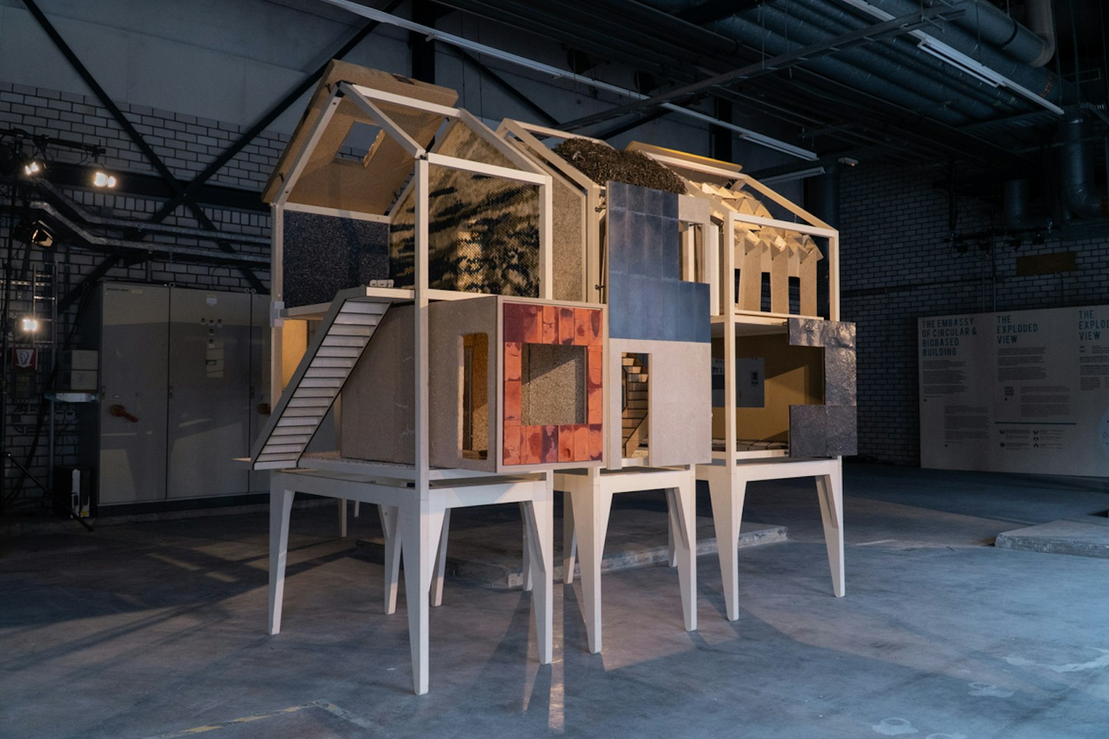
Lucas De Man and Pascal Leboucq are also delivering a universal message of hope with their projects The Exploded View and Beyond Building — which was recently named the best installation of Dutch Design Week 2021 by leading site Dezeen. With their studio Stichting Nieuwe Helden (New Heroes Foundation), artists put their weight behind social issues related to value change. Getting the dialogue going is key. “Thanks to our theatre background, we attach great importance to the communication of our work. While Pascal mainly takes care of the visual design, I concentrate more on the storytelling. The people involved with our installation actively tell this story. In doing so, we do not assume one truth, but we adopt a vulnerable attitude in order to elicit a discussion with the visitors”, says De Man. "At the same time, we notice that the theme of natural materials is not only very popular in Belgium and the Netherlands, but also internationally. Thanks to the integration of the materials into a real house, it is easier for visitors to imagine the implementation of the new materials. But there are also deeper layers in which we ask questions, for example, about the meaning of nature or the problems surrounding our use of raw materials. In addition, we offer a showcase for a hundred or so partners. Although it sometimes takes longer to set up such a project, we are not dependent on subsidies and will soon create a network that is strong and broadly supported in terms of content.”
Since the duo got to know each other after their studies in the Netherlands, they have also established their company in our northern neighbours. "When we had just graduated, there were serious savings in cultural subsidies. That’s why we felt we had to take the bull by the horns ourselves. Moreover, we can always go back to Belgium. We like the business context in the Netherlands, where people dare to think bigger and are more organised. At the same time, in Belgium we attach more importance to content. We need a certain urgency to make something, and we like to tell a story. The surreal, poetic approach is also a Belgian added value”, says Pascal Leboucq. “We just think it’s richer to work within that duality. We love treading the middle paths and combining many worlds.”
International DNA
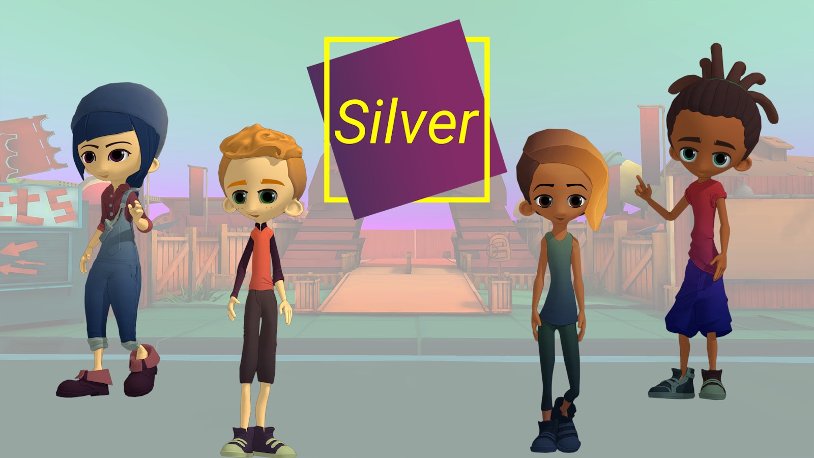
Some designers go into the field themselves with their creation. For example, on behalf of the Flemish Expertise Centre for Suicide Prevention (VLESP - UGent), Create.eu developed a game with Silver that focuses on strengthening mental health. Silver thus contributes to the prevention of suicide among young people. “Since the problems of mental resilience in young people are also international in scope, we have designed everything from the outset so that we could export Silver easily. For example, the festival grounds in the game include an active experience trail, but also a zone devoted to Asian pop culture. Or the characters have different backgrounds. We designed the underlying system so that you can easily integrate translations of texts”, says Davy Hoskens of Create.eu. “At the same time, we appealed to the substantive expertise of the VLESP team at Ghent University, and two youth book authors wrote out the storylines. Moreover, we directly involved the target group in the project, which is usually difficult to reach. They validated the concept, the sketches and even the use of colour. Silver is not intended to be didactic. In the first place, it should be fun to play.”
Create.eu is currently holding talks with 113, the Dutch equivalent of VLESP. “Silver is not a commercial game, but a so-called serious game. That is why we need to build up a network in every country with the government, with the educational system or with the youth sector. Once we’ve made those contacts, we can adjust the game quickly. The Henry van de Velde Award is an additional external confirmation of the substantive and design qualities of Silver. In an intrinsically international sector, for our studio it is also a qualitative reference for our portfolio. In addition, an internationally renowned training programme such as this one helps Howest to find a good workforce and thus be able to compete internationally.”
Perseverance pays off
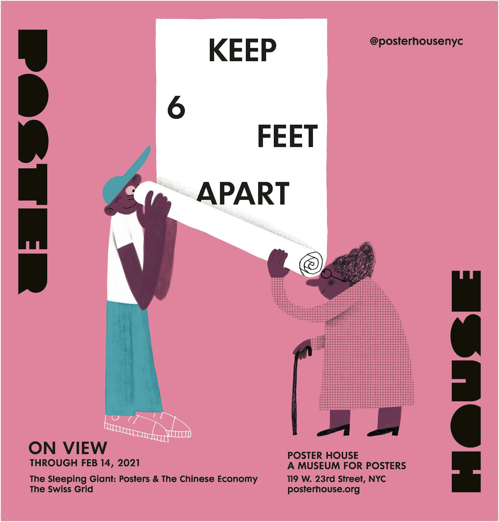
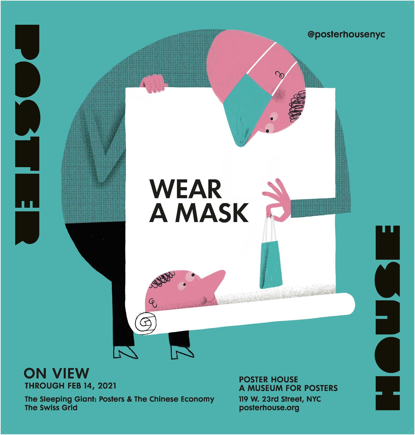
Someone who has been travelling the world with his work for years is illustrator Klaas Verplancke. As a result, he is now “big in New York”. Especially after the two campaigns he illustrated for The Poster House Museum in the wake of the COVID crisis. “These campaigns are the result of a long-term effort. Since the major publishers and newspapers all have a seat in New York, and because I personally love the city enormously, I’ve been going to The Big Apple at least once or twice a year since 2010. I have gradually built up a broad network there and have good contacts with the Flanders House team. Sometimes, within that network, someone changes position, or certain pieces of the puzzle fall into place, resulting in a new assignment. Keeping your network active and monitoring it properly is the message”, says Verplancke. “On such a prospecting trip, I make an average of seven to eight appointments a day. You then have ten minutes to present your work to the art director, but these live meetings stick with you much longer than the countless emails with portfolios that such people receive. To be able to present my work in the best possible way, I make the magazine BANG. I also give a designer carte blanche to reinterpret my work. From my background in advertising, I know how to sell myself. Because I returned each time with a number of assignments, I recouped the investment almost immediately.”
“In terms of working method, there is not so much difference between Belgium and New York. Although everything has to go much faster and contracts are much more strictly regulated. They also pay more attention to diversity and inclusion. From that experience, I now think about this as standard in my national work.”
When Verplancke found the courage to write to the authority Steven Heller, he promptly received an answer with “drop by”. “Steven has written about all possible aspects of graphic design, and is therefore a sort of guru for the sector. Among other things, he serves on the board of directors of The Poster House Museum. When, at the start of the pandemic, the team was looking for illustrators to depict abstract concepts such as social distancing, he suggested my name. Coincidentally, the image I had just created for Knack Weekend was in my digital signature. It caught the attention of the museum team and became one of the campaign images. So my GIF image suddenly ended up on 1,800 advertising panels in New York, even in Times Square. Normally I would take the plane straight away to see that with my own eyes. Unfortunately, I now had to settle for other people’s photos.”
After the coronavirus campaign, Klaas Verplancke was given a new assignment by the museum: to devise a series of images for the reopening. “While this second campaign won a Henry van de Velde Award, I learned recently that my first campaign images were purchased by the Cooper Hewitt Museum in New York. The fact that my work is now part of their collection of applied art makes me very happy. Although the item in Het Journaal about my posters in New York was also a special moment.”
Local anchoring
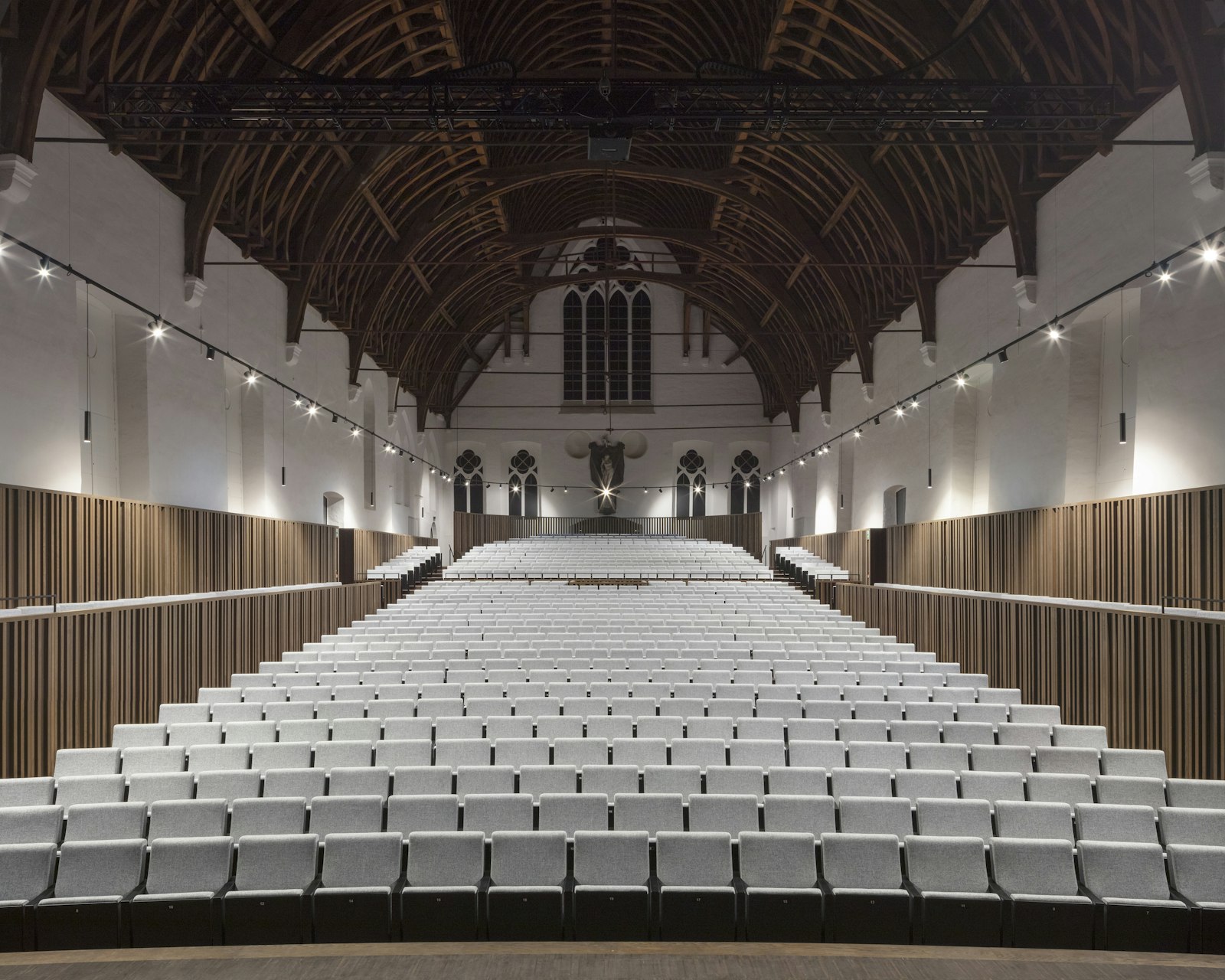
The story of London’s DRDH Architects shows that interesting clients can provide for some international vitality in our regions. Based on their experience with the Stormen concert hall in Bodø, Norway, they were assigned the task of redesigning the concert hall in Bijloke, Ghent. “The Open Call system of the Flemish Architect is unique in the world, and allows foreign agencies to apply for local projects. At the same time, it boosts the quality of Belgian agencies. That is one of the reasons why they now enjoy a great deal of international standing. Because building requires a lot of local knowledge about regulations and site supervision, international agencies often work with a local partner, which creates exciting synergies,” says Jef Driesen of DRDH Architects. “Since our agency is also working on assignments for the Antwerp Bourla, the Ghent opera and a few urban housing projects, and I wanted to move back to Antwerp after seven years in London, we decided in 2019 to set up an office here as well. The partners regularly travel between the two and the teams also work closely together. The fact that we as local employees speak the language of clients and contractors simplifies cooperation within the various projects.”
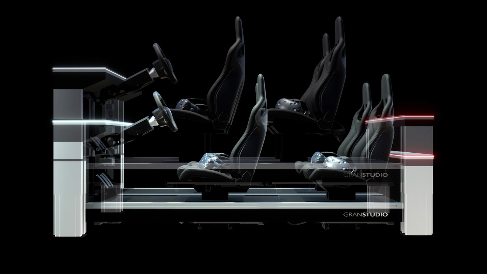
They also share this experience at Lowie Vermeersch’s Granstudio. “If we participate in the search for a suitable interpretation for the Spartacus plan in Limburg, it is necessary to know in detail the context for which this mobility plan is required. Cycling, for example, is part of the Limburg mobility culture, whereas in Turin it is not the case at all. I also think that the combination of our Belgian sobriety and the more Southern, artistically freer Italian approach leads to a nice balance,” says Wouter Haspeslagh. “After twenty years of experience, I can say that our culture is rather neutral, which makes it easy for us Belgians to adapt to different cultures. Although international customers value our link with the Italian design context more than our Belgian background,” adds Lowie Vermeersch. “At the same time, the product often defines the design language. For example, the automotive industry requires mass production, and therefore a more global, universal design language anyway. Our Digiphy platform is also a good example of this. The combination of a physical structure, which can take on the ergonomics of almost all existing cars or be easily equipped with all kinds of attributes, and a virtual extra layer of experience makes it very accessible for people to understand the car design and evaluate it remotely.”
Valued quality label
Although Granstudio often collaborates anonymously on international projects, and at the same time has not communicated much about its own projects until now, Lowie Vermeersch has decided to change that in 2020. “The main reason we register for an award is the communication. That is why, for example, we attach great importance to awards such as those of the online design blogs Dezeen and Designboom. At the same time, it only makes sense to try to win an award if the award itself has a high-quality reputation. That this quality is guaranteed at the Henry van de Velde Awards, and that it will also give us extra visibility in our own country, makes it interesting for us,” says Vermeersch. “In addition, for example, towards the Asian market where we are very active, it is important to be able to come up with such prizes and endorsements.”
Kern02 also had to be very discreet about their icons for Cisco Systems over the past ten years. “With the departure of our contact person to Google, we wanted to redeem the credits for our work. We have therefore requested permission to participate in the Henry van de Velde Awards. Not only this prize, but also the enthusiasm of our former contact has given us a boost. Now that she knows we are among the laureates, she plans to head to Brussels herself. When you know that we have only seen each other once in the past ten years, you immediately understand how much importance she attaches to this award. And perhaps one day a project for Google will emerge,” concludes Christophe Heylen.
On 8 February 2022 you will find out in Bozar who is going home with a Gold, Silver or Bronze Award and who will win the Lifetime Achievement, Young Talent, Company, Ecodesign by OVAM and Public Gold Award.

