de Velde
Letters op maat
Custom typefaces are fonts developed from logo designs.
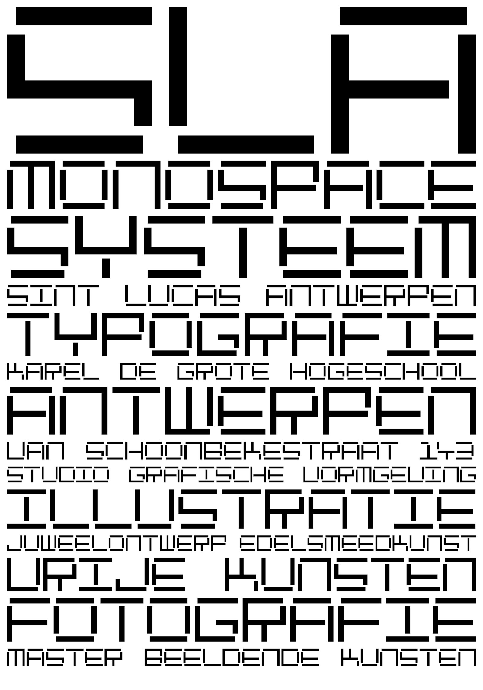
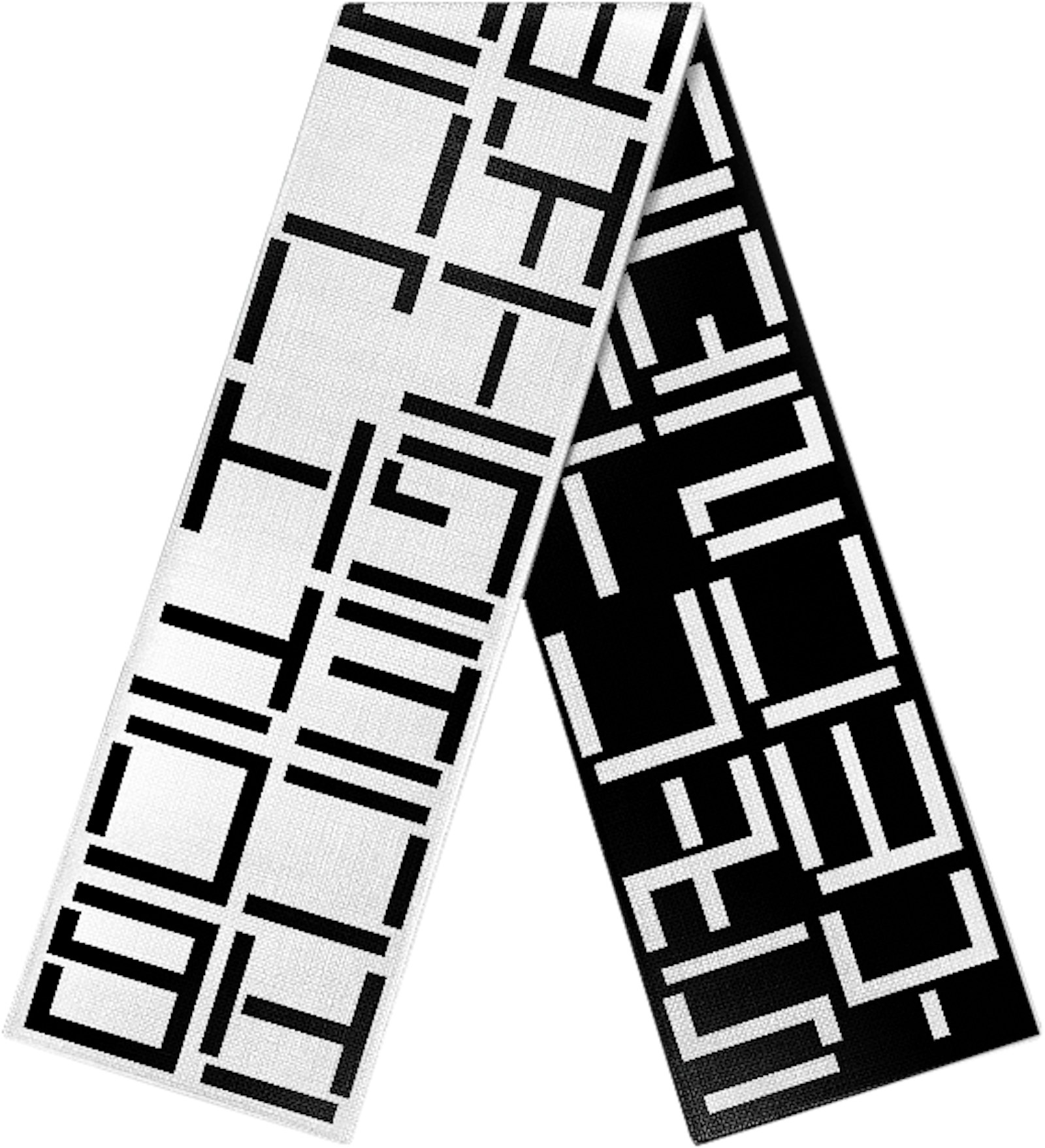
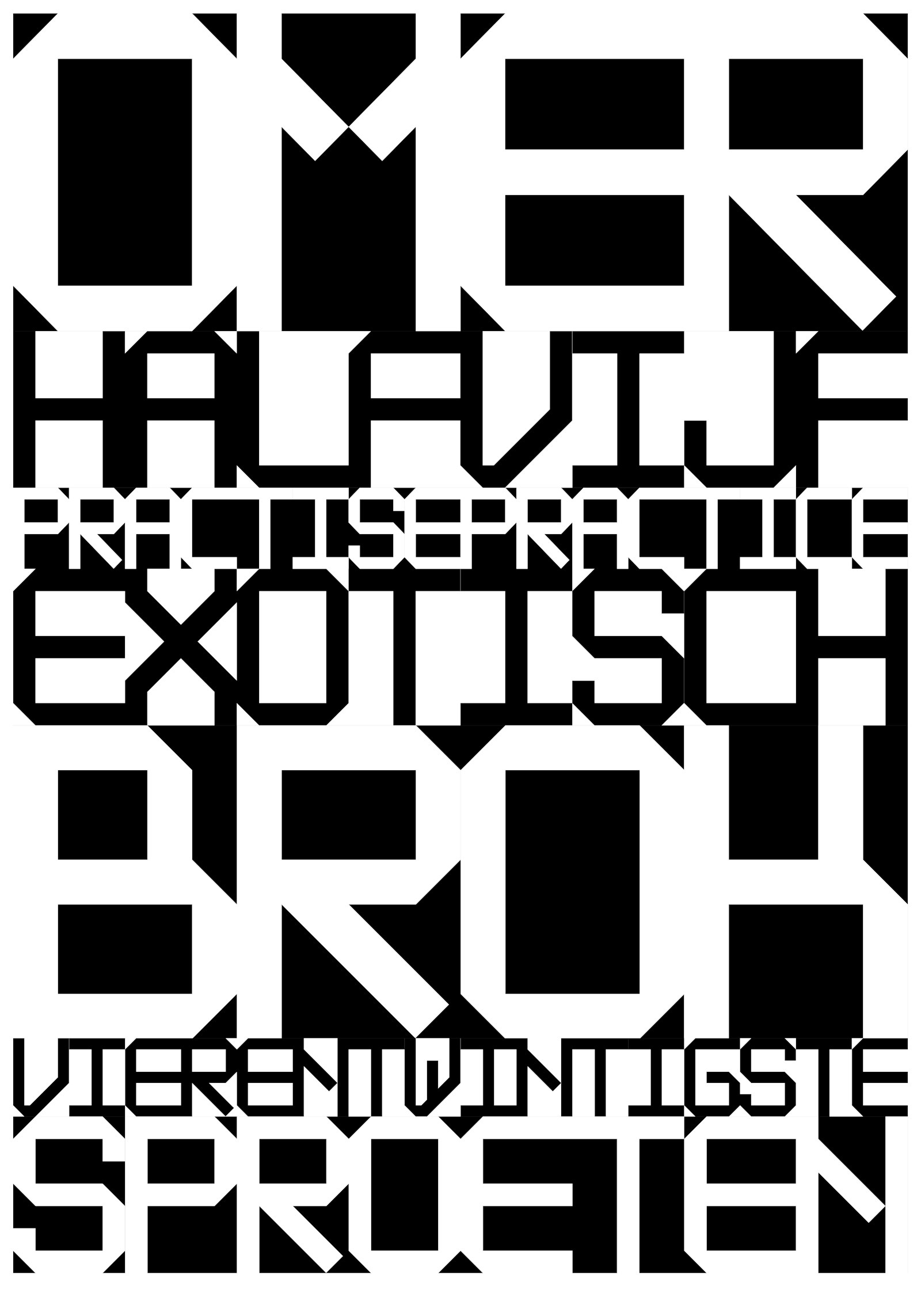
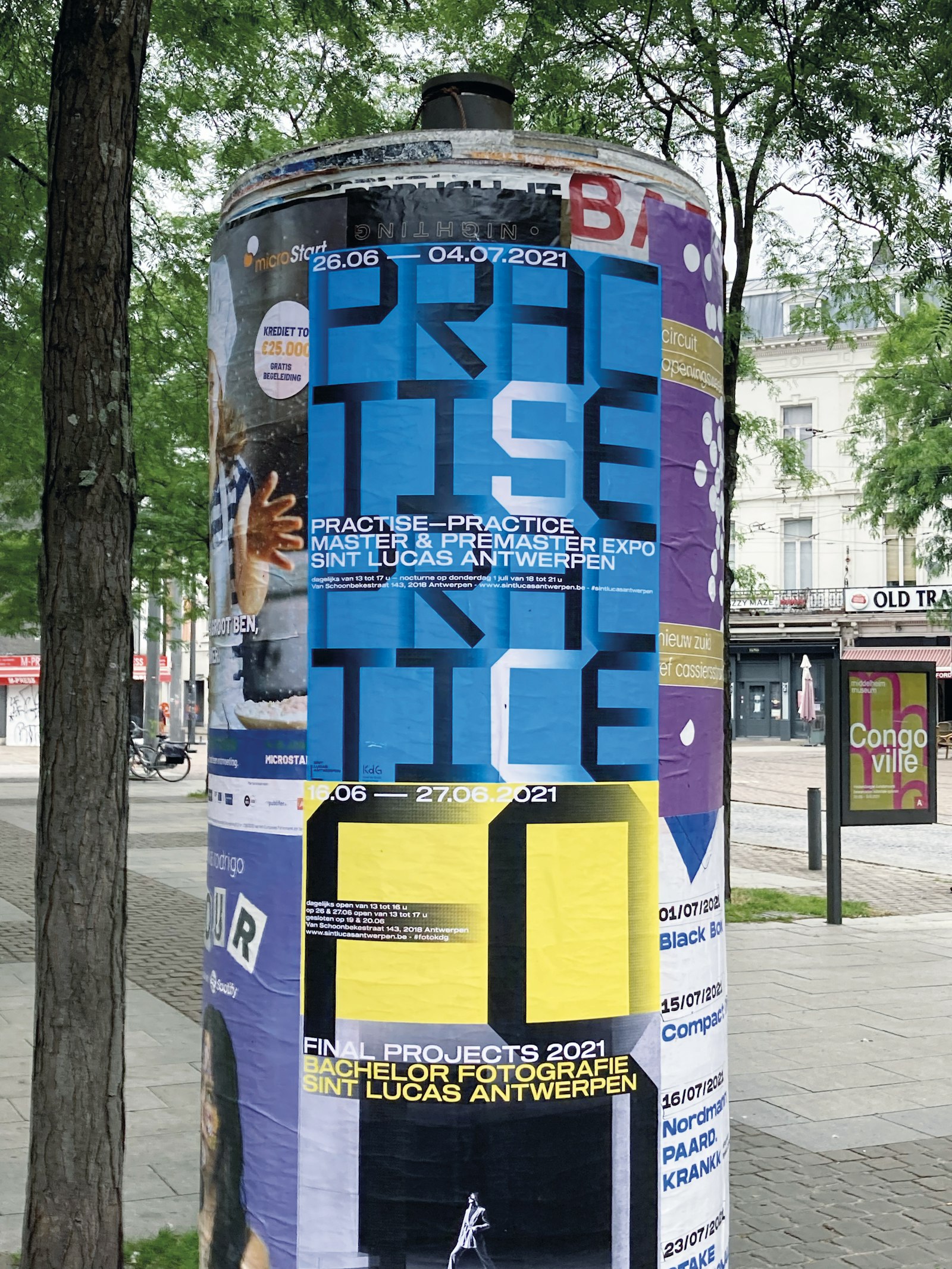
Erik Desombere developed three fonts, in which mathematics and systematics play an important role. He designed a typographic logo for Greenconcepts within a grid of two squares wide and four high. This led to the development of a font with different height variants, with the letters being able to be used interchangeably. The second font grew out of the design for the new logo for Sint Lucas Antwerp, with the building’s facing brick joint as a formal starting point. Referencing a hand-drawn 1987 logo design for Industrimmo, he created a third font with a solid grid of five by seven squares, criss-crossed with every possible diagonal.
The jury on Custom typefaces:
This project comprises material from an entire career and therefore presents a whole body of work. It ties in with the retrospective exhibition by Erik Desombere in Menen and shows a stripped down, constructivist, playful way of working with typography. Erik draws inspiration from vernacular typography, or letters in the public domain, but he also deals with the history of his discipline and typography. He successfully translates these elements into a very measured design and consistently searches for typographic solutions to design problems. His project demonstrates both thorough and well-supported research and very concrete and usable applications of the research results.
What does this award mean to you?
It was as a student at art school that I discovered the possibilities of typeface. It is there that my love of typeface arose, which grew into fascination and drive. During my studies at Sint Lucas Antwerp, I was given the space to work with typeface, to construct typographic ‘images’, to create a complete alphabet. Professional assignments gave me the opportunity to further explore typeface and typeface links and words and word relations in typographic logos. Over and over, in a concerted quest to find connections. The ‘love of typeface’ is a message that I invariably pass on to my graphic design students. More than ever, the ‘love of typeface’ is a passion of mine. And the award is probably a recognition, an affirmation.
How did the idea for this project come about?
Every time I’m given an assignment for a typographic logo with corporate identity, I see possibilities for further research, extensive experimentation and systematic development of the design. The motivation is persistent and can lead to a complete alphabet (capitals, lowercase or both). The addition of an extra typographical key completes the process, as is the case with Greenconcepts, where a number of letters exist in different heights and the logo can thus be generated in various forms.
What makes your project so special?
What excites me most is the design process: building, refining and improving. Repeated research into new typographical possibilities always surprises. For example, research into the open/closed angle connections in the supplementary font for the Sint Lucas Antwerp logo remains an exciting challenge for me. Constructing, weighing up, testing and evaluating the 81 combination options for the square and applying them to the different letters produced important insights. It allowed me to weigh up the light/dark effect of the horizontal and vertical strips against each other. The grid-based research methodology as a starting point is clean, can certainly produce results even in complex approaches and is therefore transferable to other designers.

