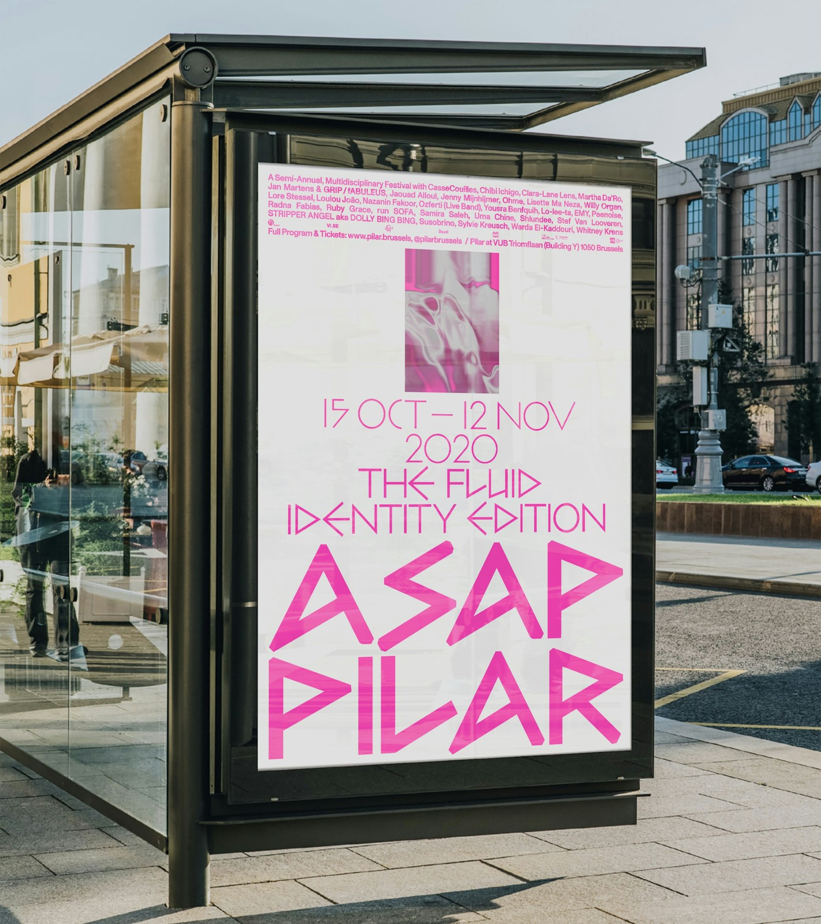
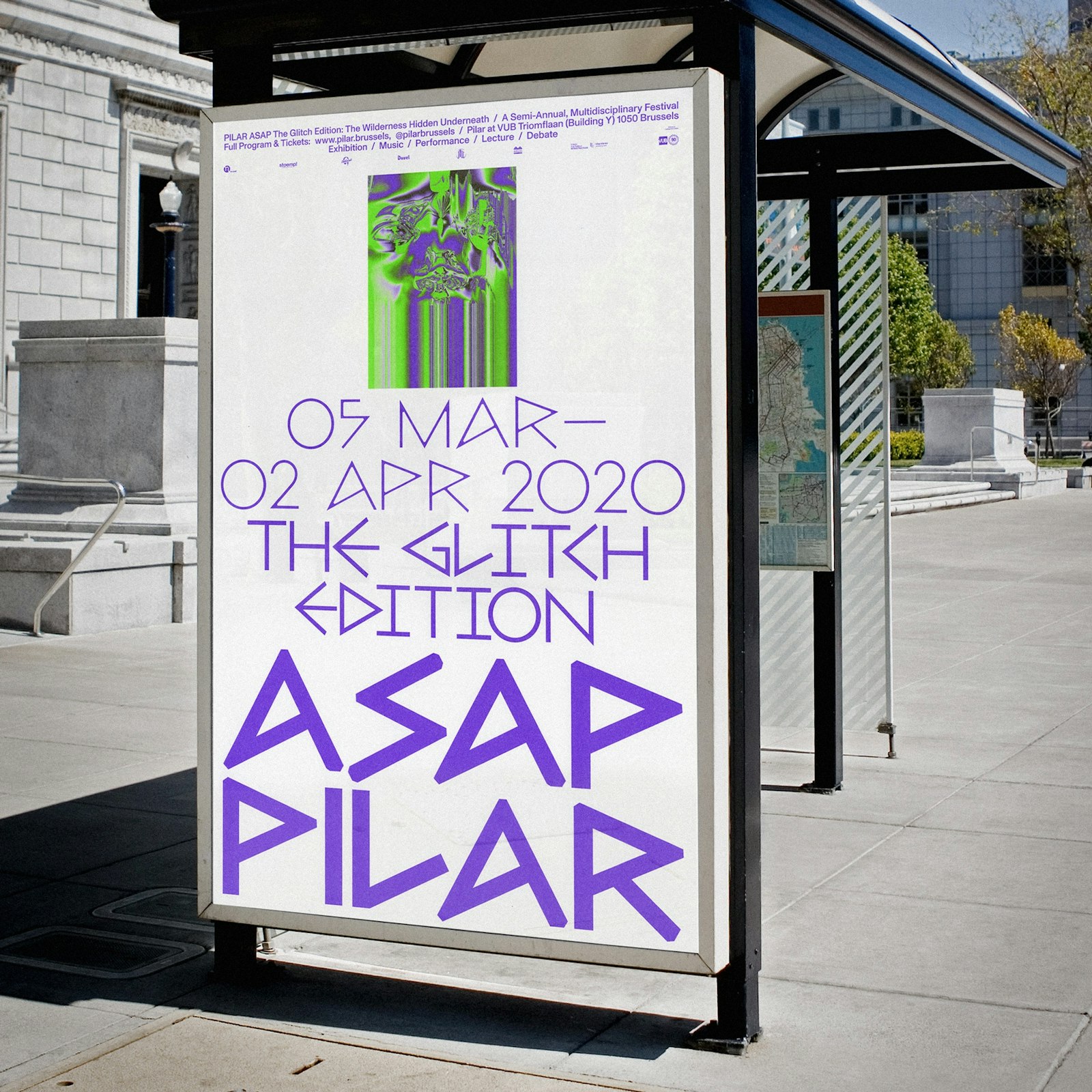
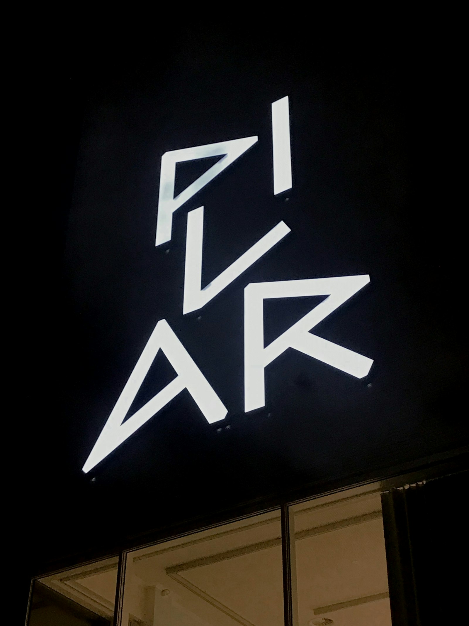
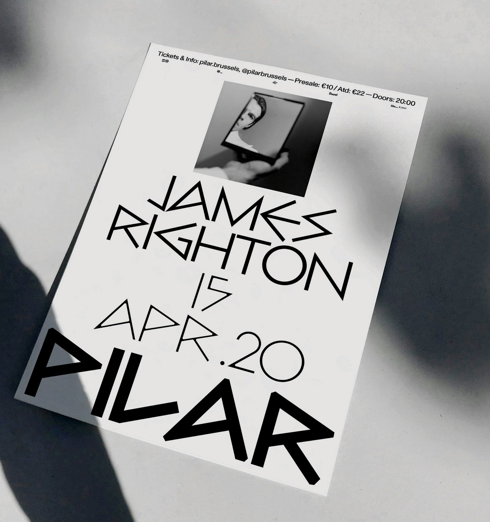
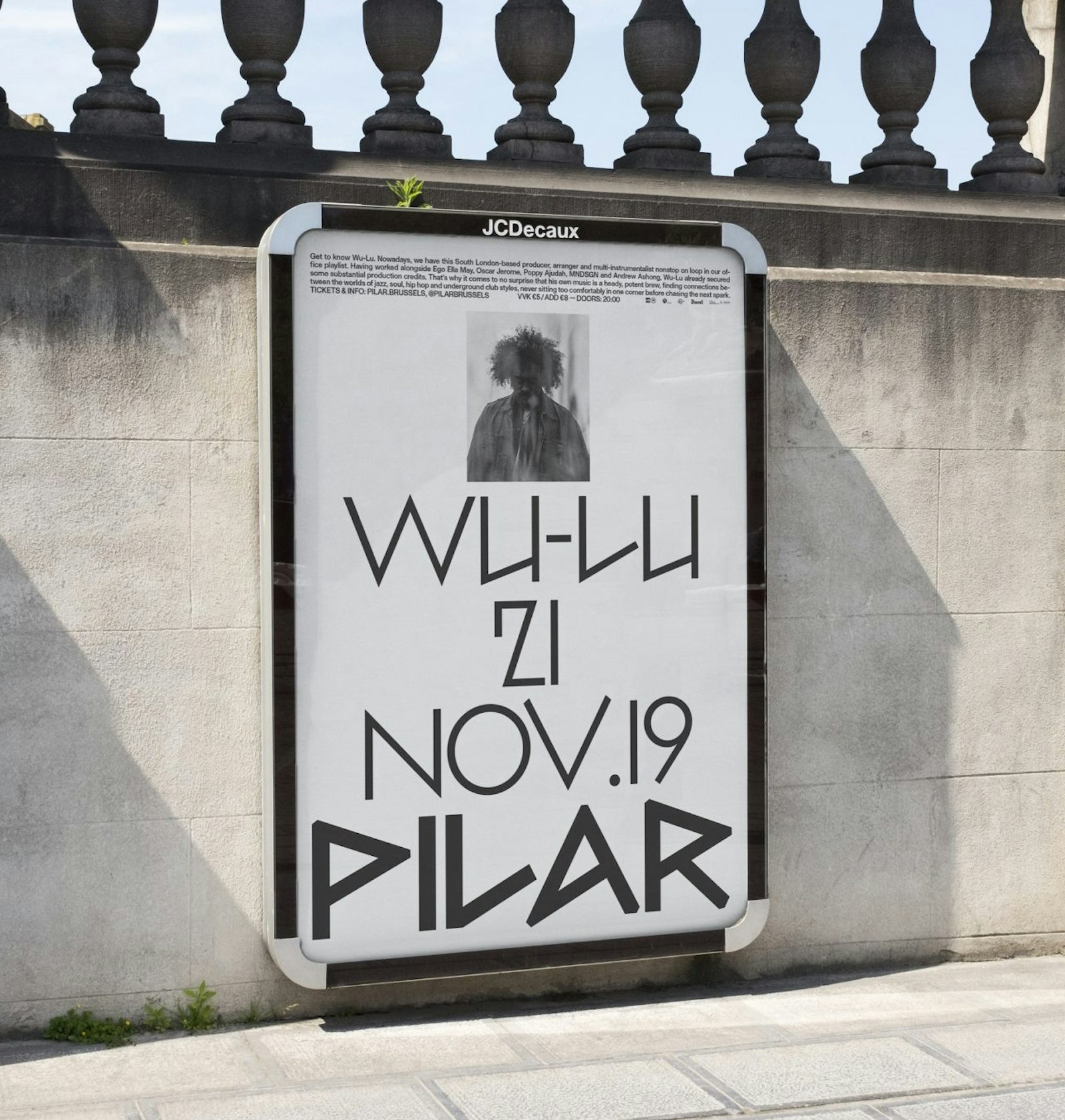
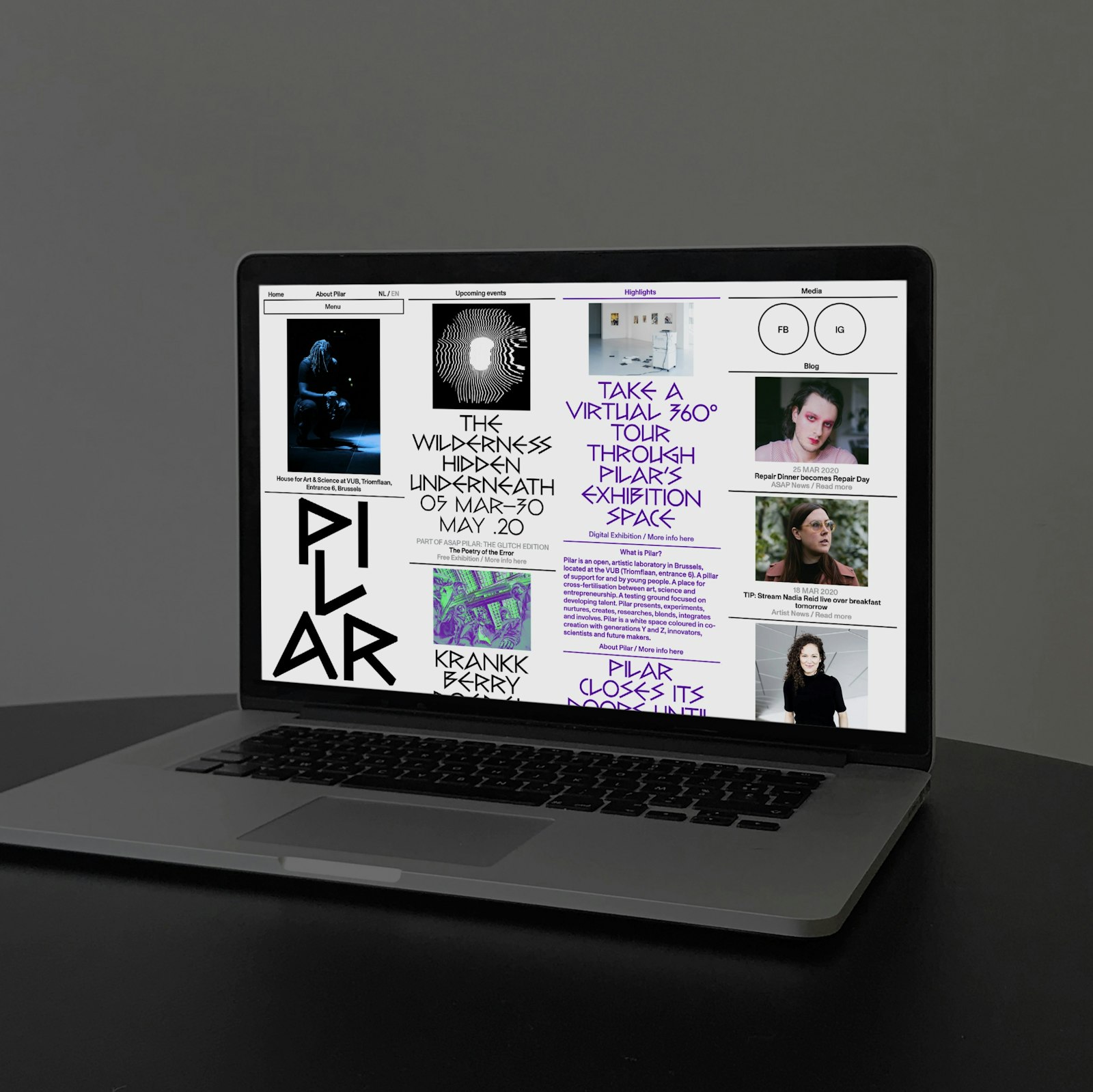
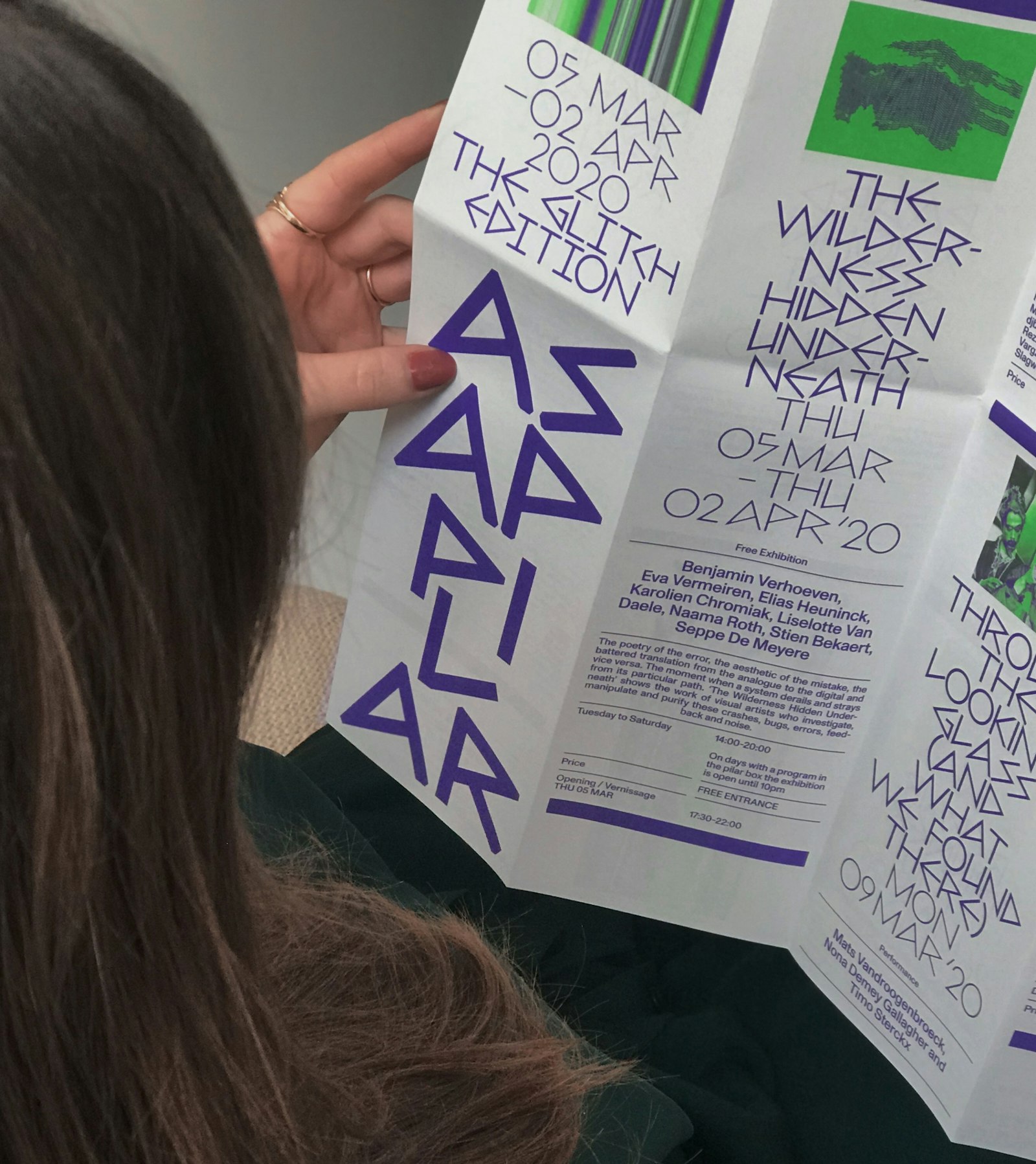
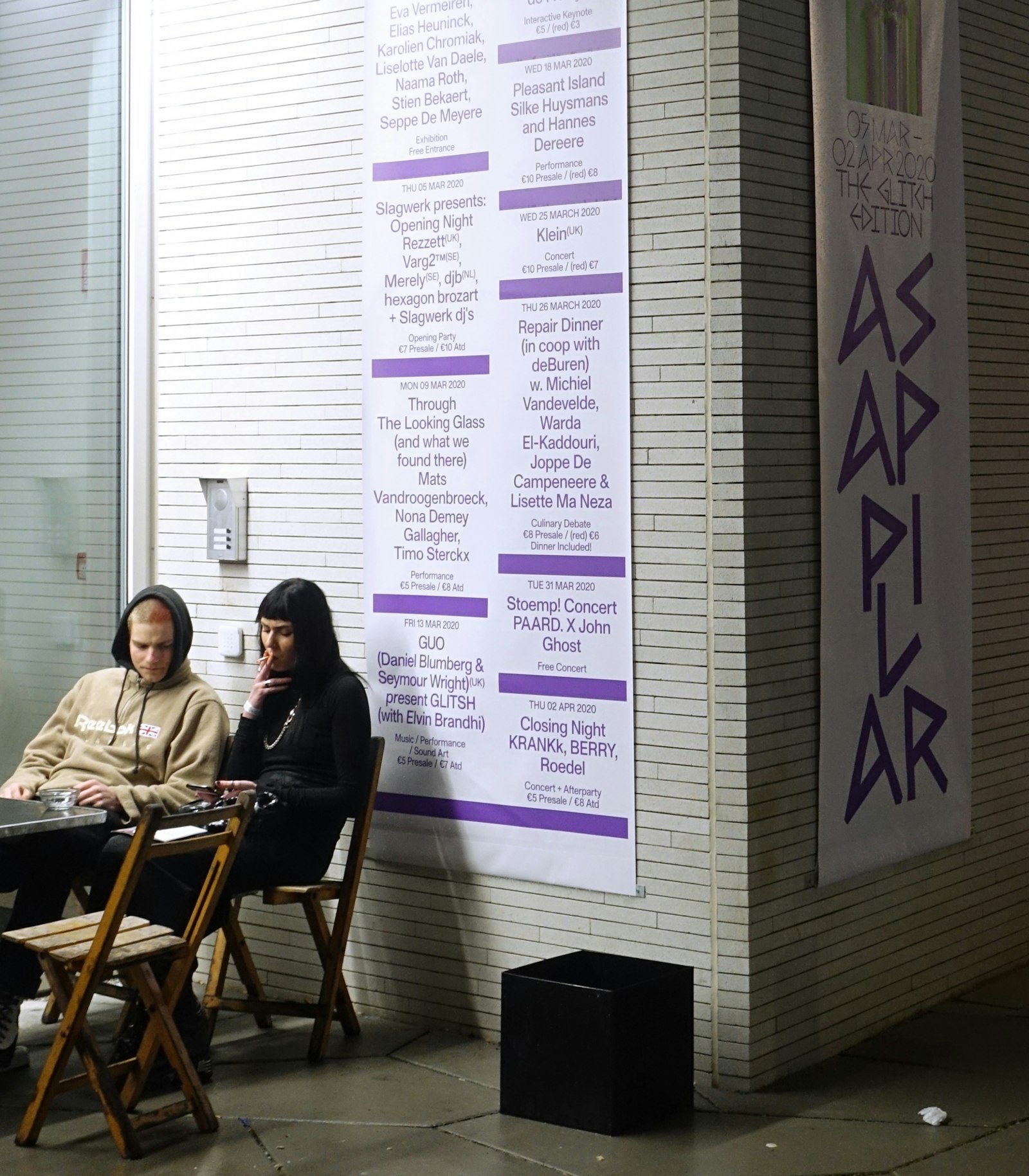
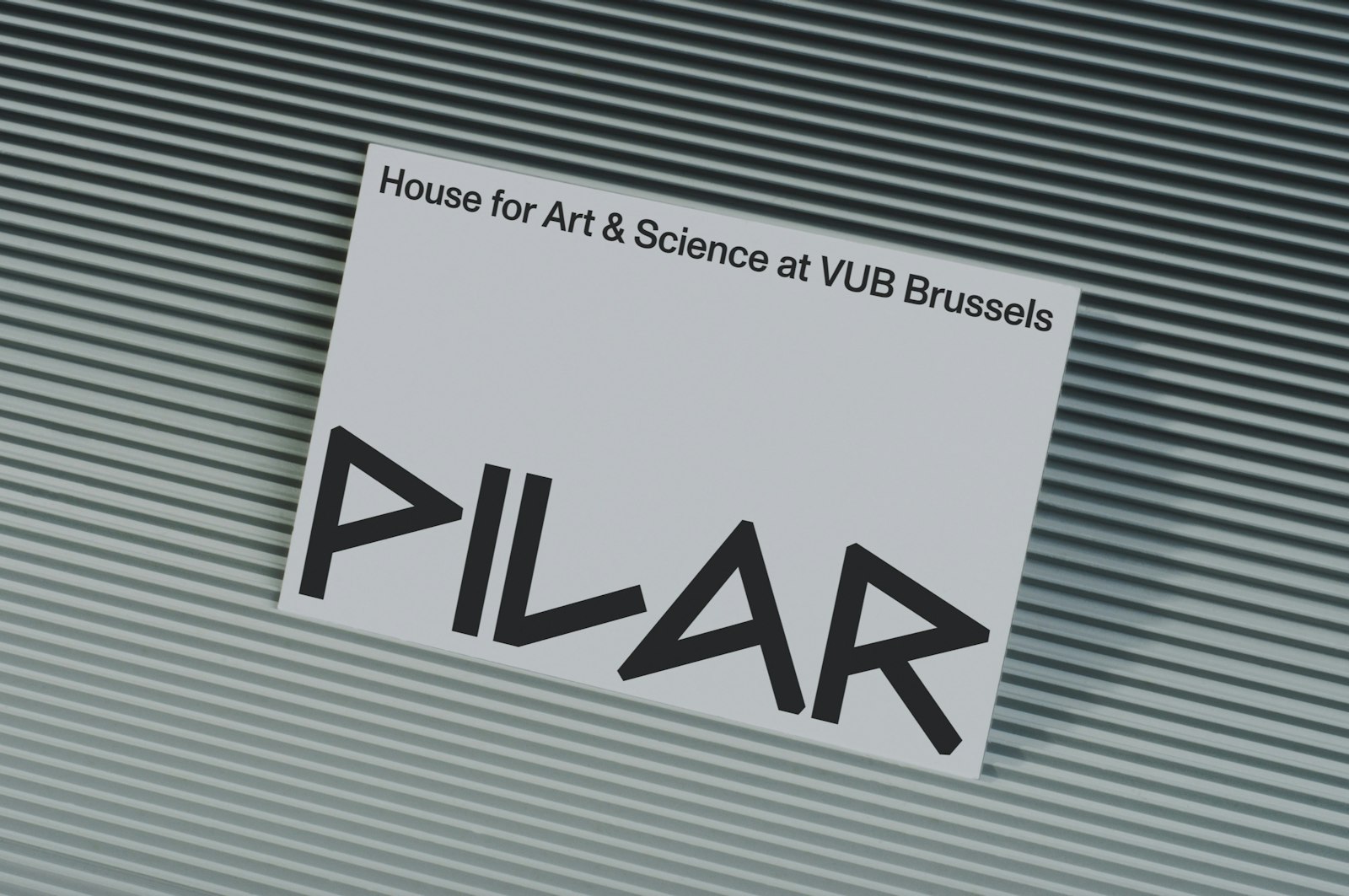
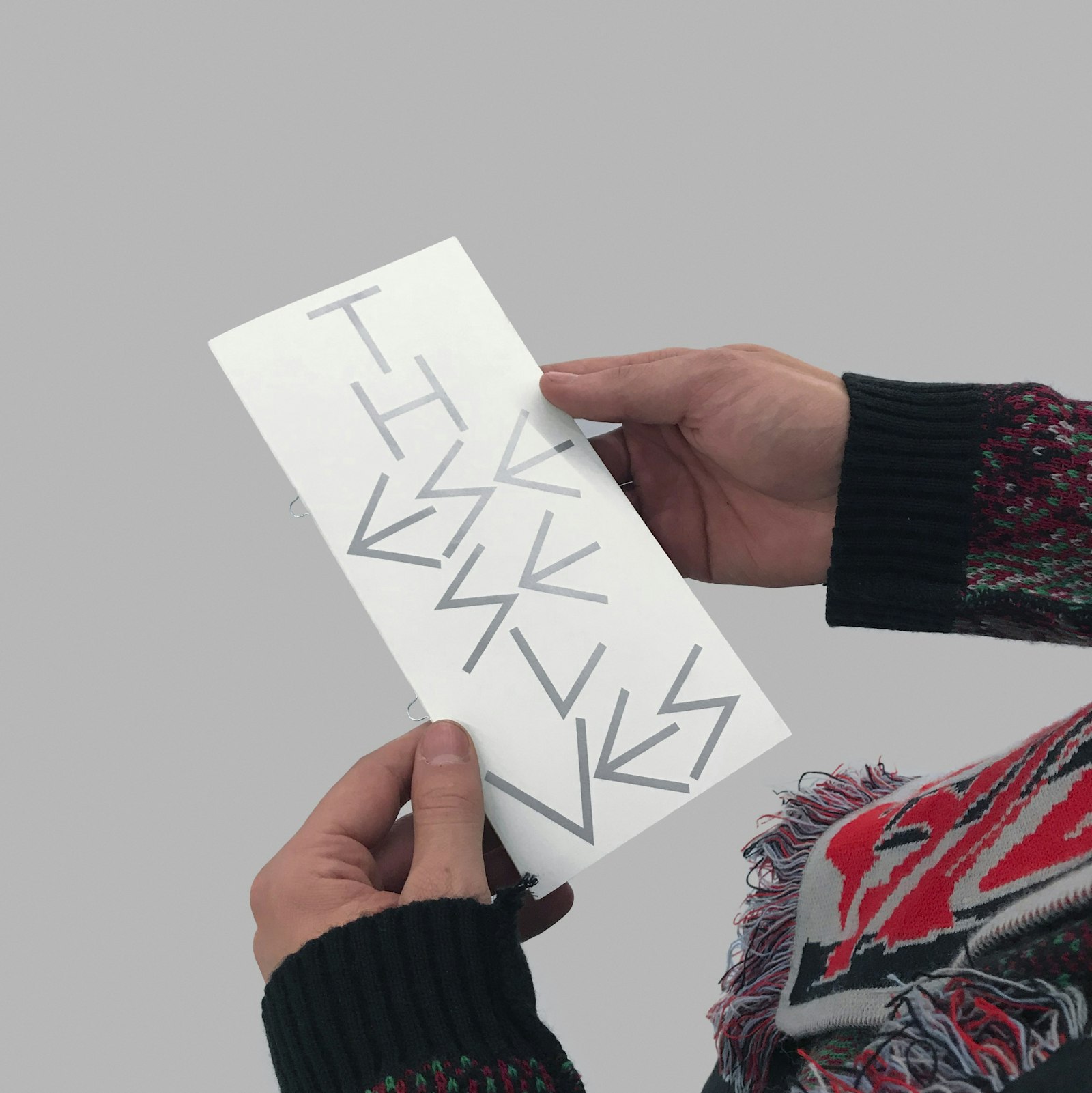
It serves as a testing ground for art and talent development. Twice a year the centre organises Pilar Asap: a multidisciplinary festival of exhibitions, performances, lectures and workshops. A selection of young artists and musicians that Pilar believes should be on everyone’s radar takes centre stage. As far as communication about the festival is concerned, designers Corbin Mahieu and Lennart Van den Bossche went in search of a typography that embodies the different worlds of Pilar: the historical force and age-old generations of the university on the one hand and the rebellious, punky youngsters of Pilar on the other. The font Bill from 1950 by the artist Max Bill (1908 - 1994) encompasses both elements: it is based on the ancient Cuneiform that was used in temples to transfer knowledge on inscribed stone tablets. The font also leans towards a graffiti-based style that is perfectly suited to the cultural centre’s young, edgy target group. The Mahieu-Van den Bossche duo imposes strict rules for creating a unique visual language, in print as well as online. For example, the letters are always centred and stacked on top of each other, to represent a pillar.
