de Velde
Opera Vlaanderen seizoen 2018/2019
Led by Aviel Cahn (2009-2019) as artistic director, Opera Ballet of Flanders provided consciously opportunities to (young) talent and various art forms.
Together with Sang Vandenbosch, who has provided the graphic design for years for Opera Ballet Flanders, there was chosen resolutely to work with another artist, painter, photographer or illustrator each year. The images were always the starting point for the launch of the season’s theme and the choice attested to a certain courage. There wasn’t chosen for the easiest path, but to question certain social topics. In this field, the graphic design made themselves socially relevant. The audacious course of Cahn was a success because Opera Ballet Flanders got the title of ‘best opera house of the year’ in 2019. This was reflected in the design during these years.
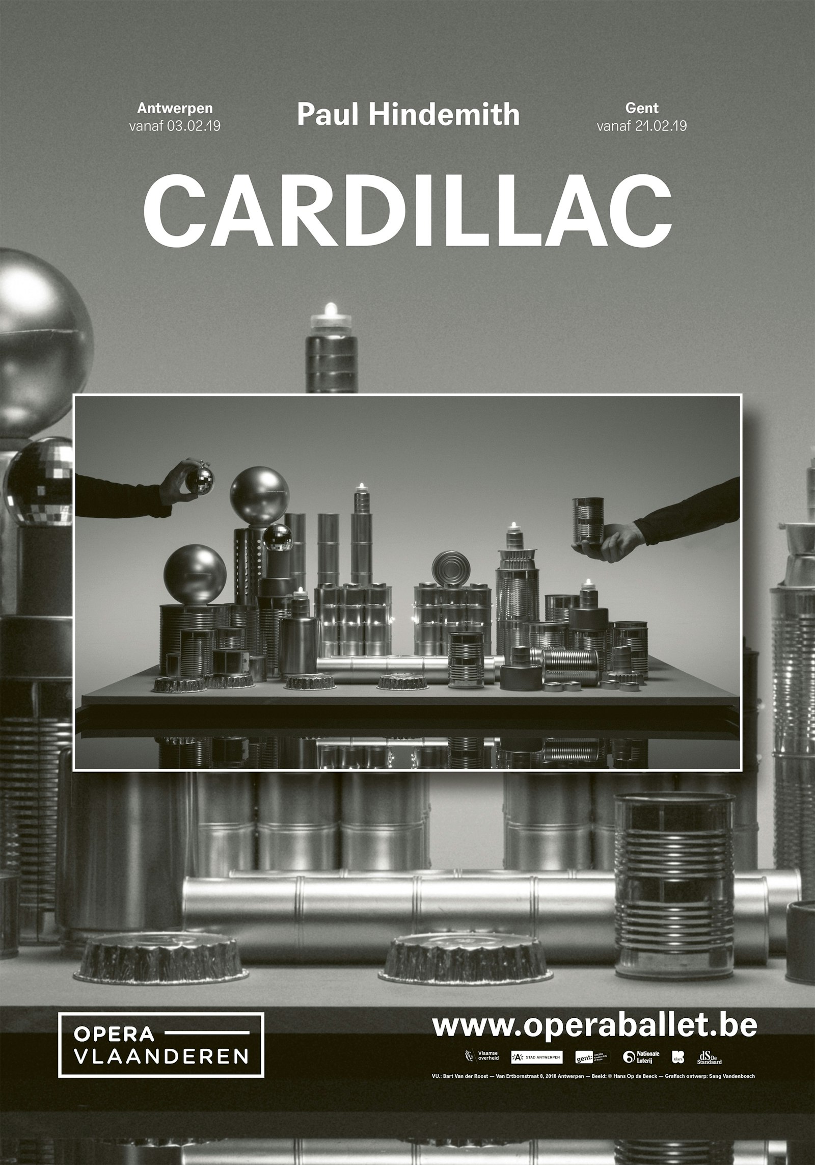
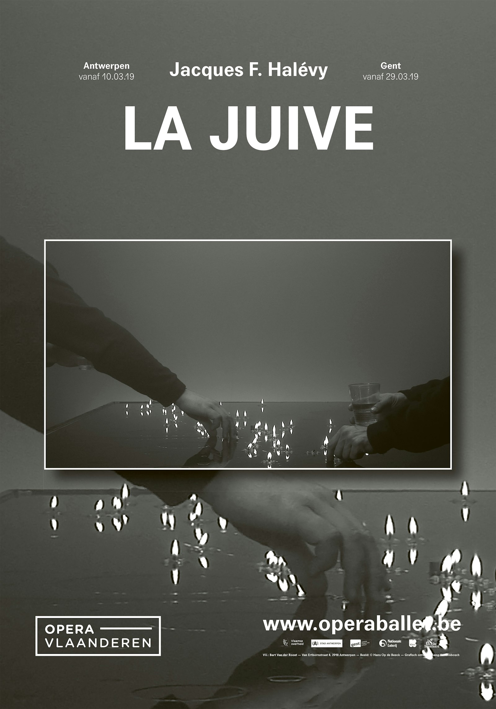
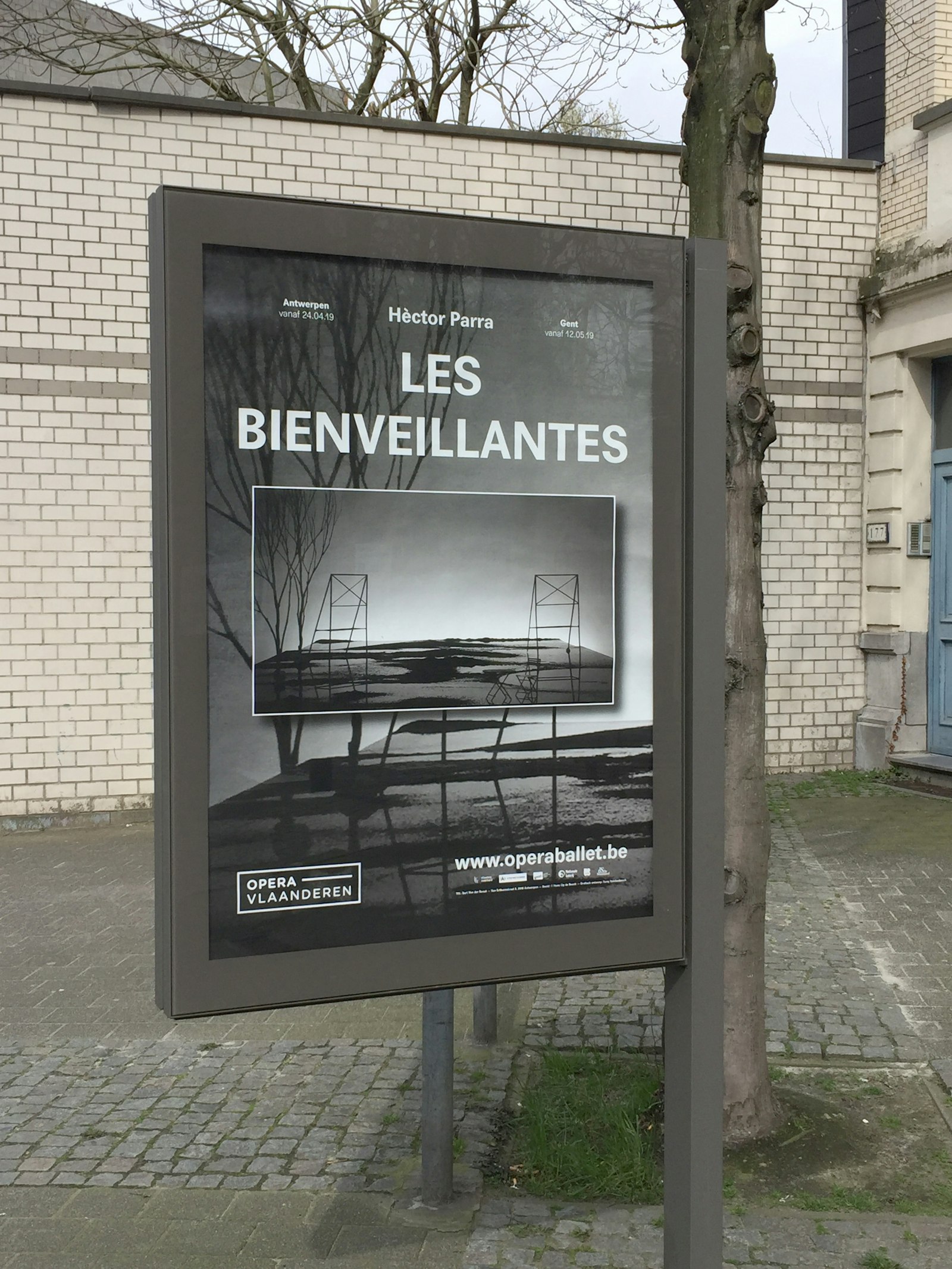
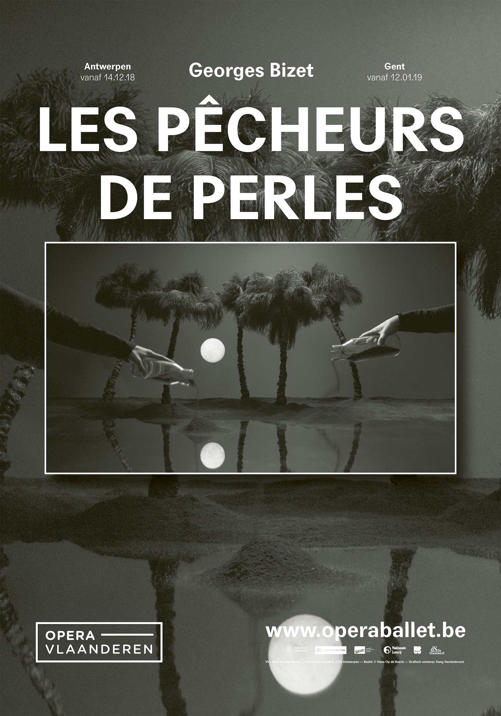
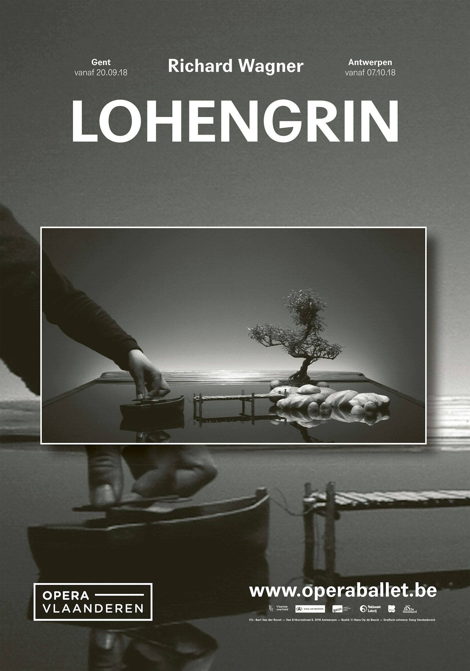
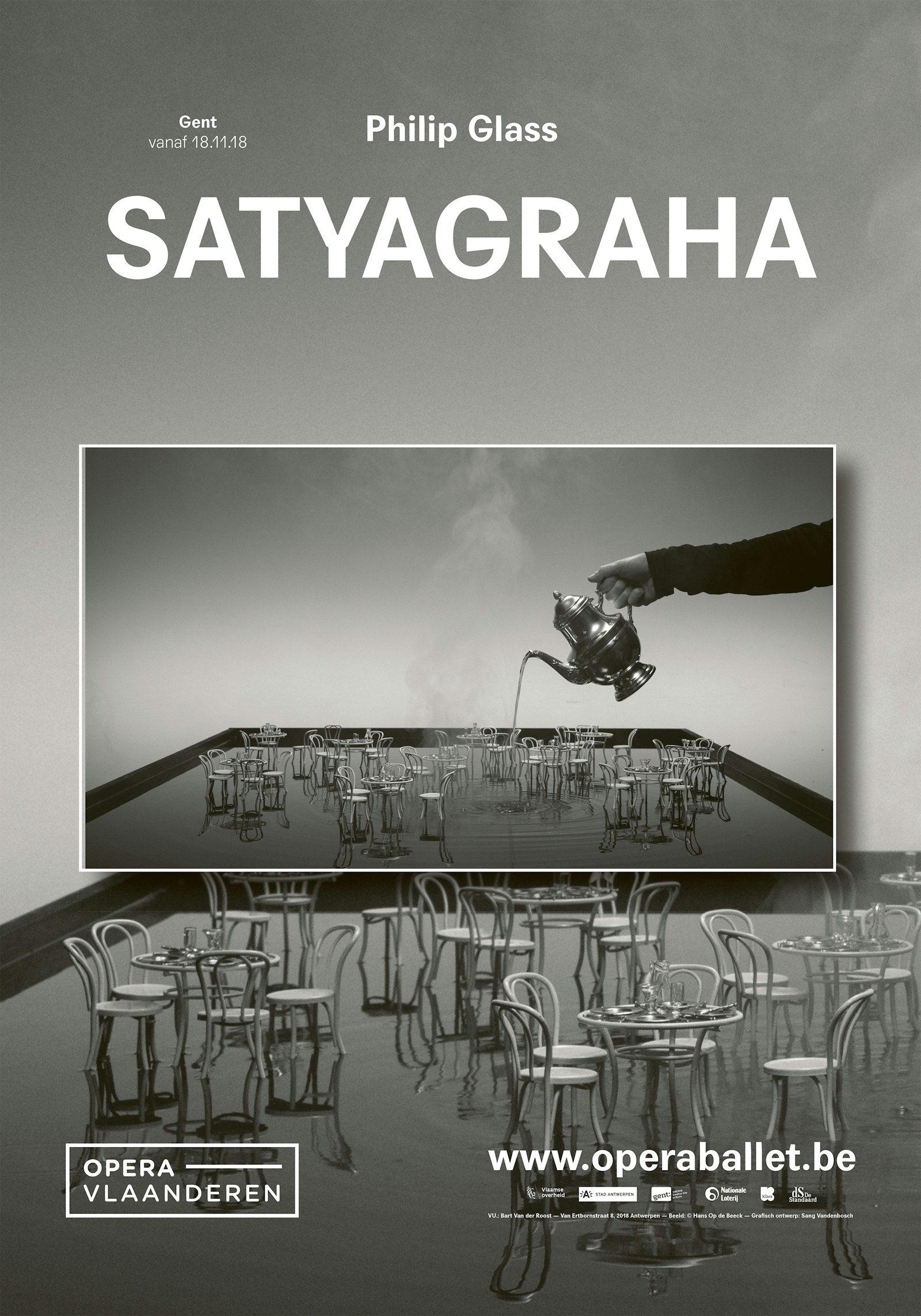
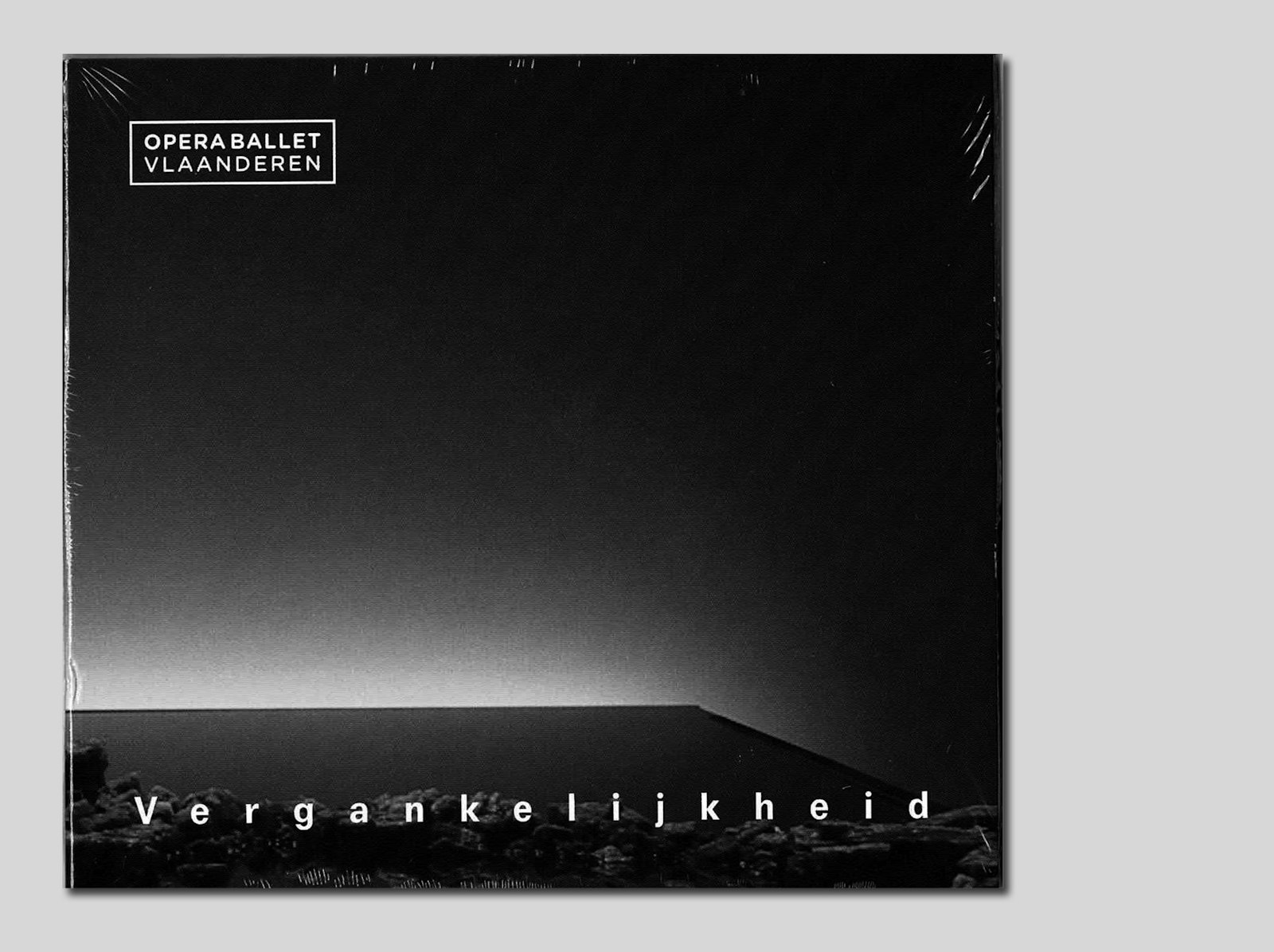
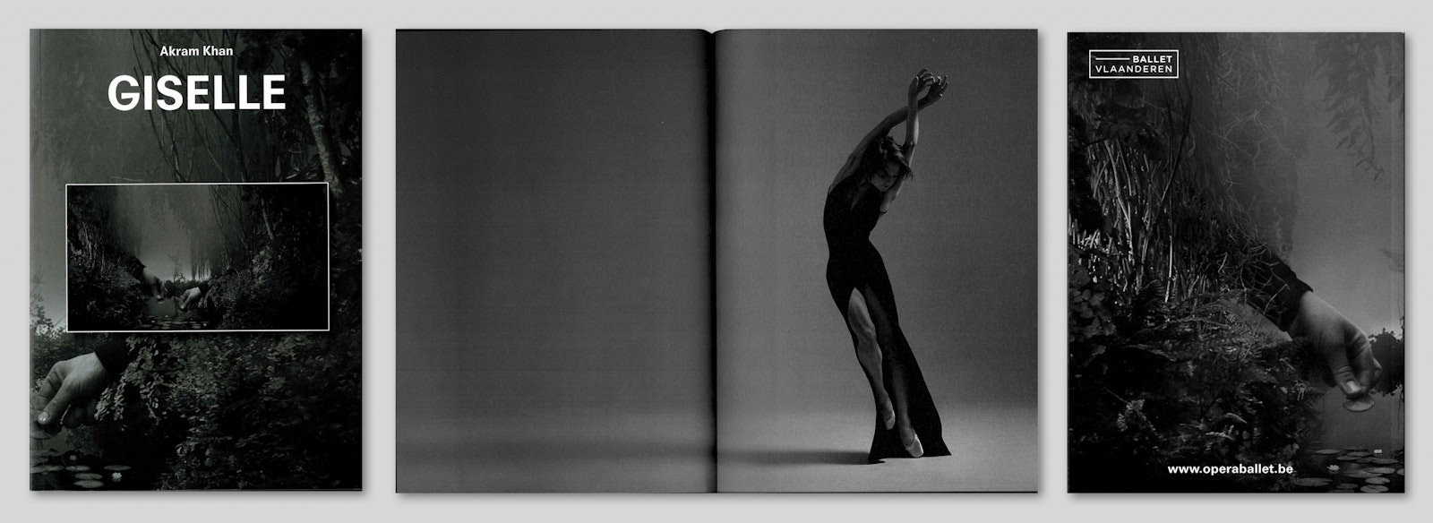
For the season of 2018-2019 of Opera Ballet Flanders stills from films of Hans Op de Beeck were mostly used, where images joined perfectly the theme of the season: ‘Mortality’. Every end is the beginning of something new. The stills from the movie “Staging Silence” formed the basis for the new campaign images for the production and global for the season. These images get a new life on the posters, program books... Another meaning than in their original video art.
During designing the posters, the seasonal brochure, flyers, programs... it’s intended to introduce and promote the performances of Opera Ballet Flanders. There is no intention to create an art catalogue or a poster for a new exposition. To design for Opera Ballet Flanders requires another approach than designing for an artist whose images are used. In fact, there’s more freedom, if you have the permission of the artist of course. The purpose is not to present the images of a certain artist, but to introduce and promote the opera and ballet shows.
Something unusual happens with the images of Hans Op de Beeck. They are duplicated. On every poster you see the same image twice: a close up with the whole still smaller above. An illusion is created, which is dispelled by zooming in on the image. The image is cut, posted filling the whole page with the total image. The typography is sober but it has character. All colour is faded. A new, intriguing image develops and gets quickly attention in the streets of a large public. Almost everyone walking through the streets in Antwerp or Ghent gets to know the work of Hans Op de Beeck. And vice versa: the people who know the work of Hans Op de Beeck will buy more quickly a ticket for the opera.
