de Velde
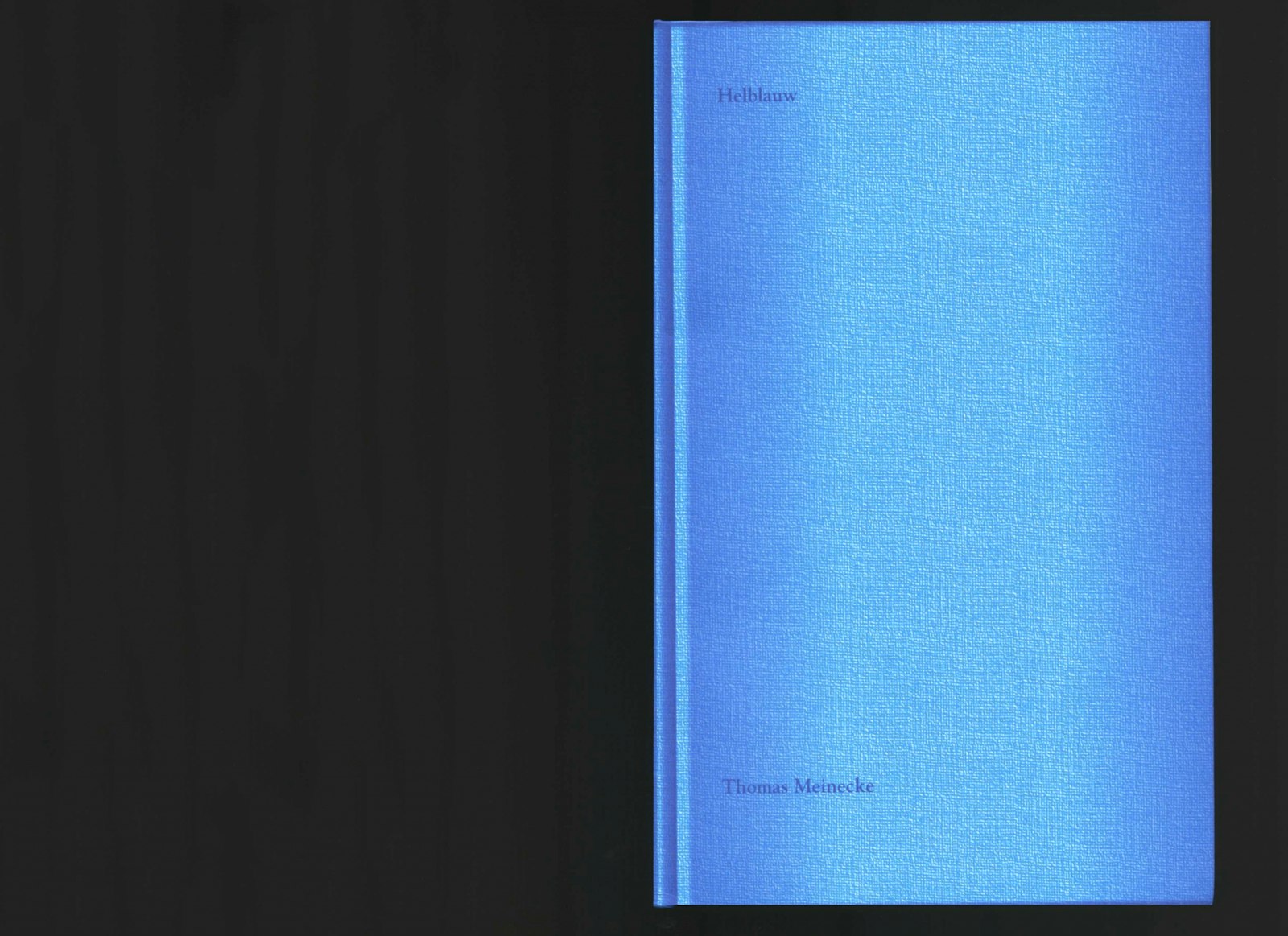
Helblauw, Thomas Meinecke
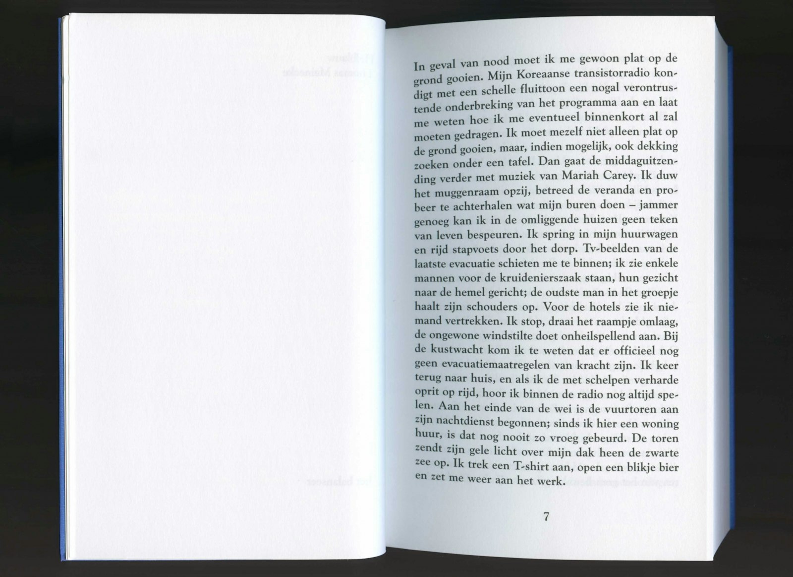
Helblauw hasn’t been published as a regular novel, typed in a no matter what font.
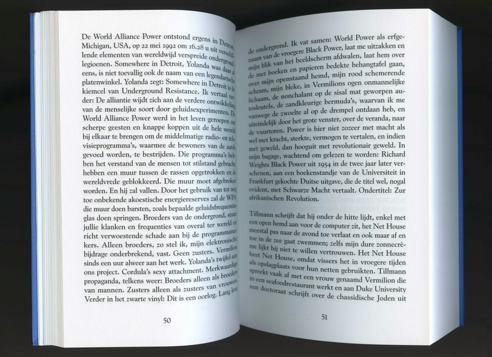
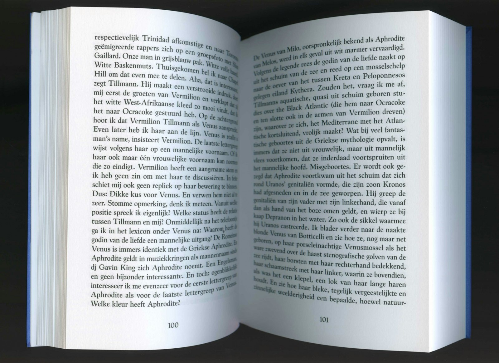
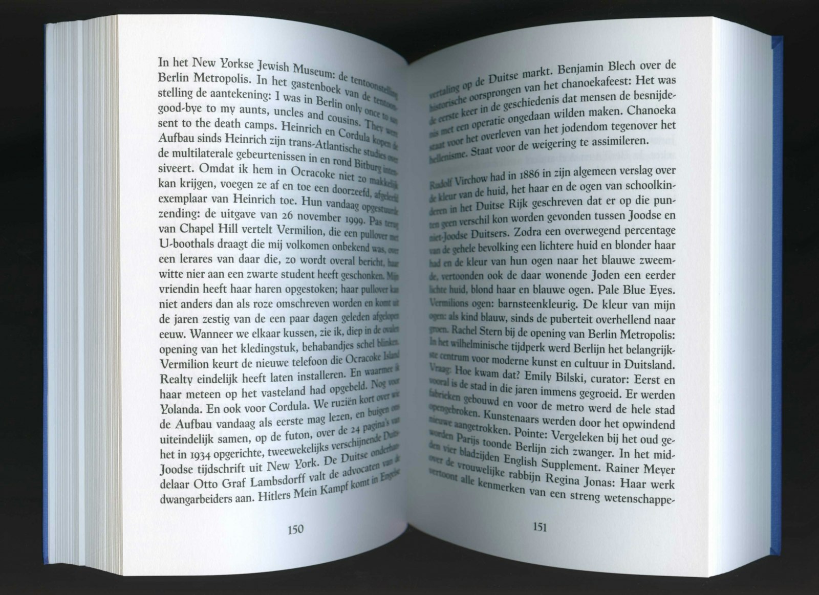
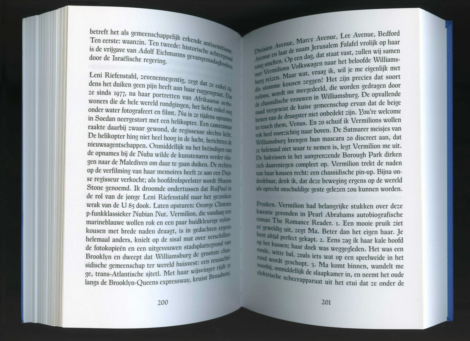
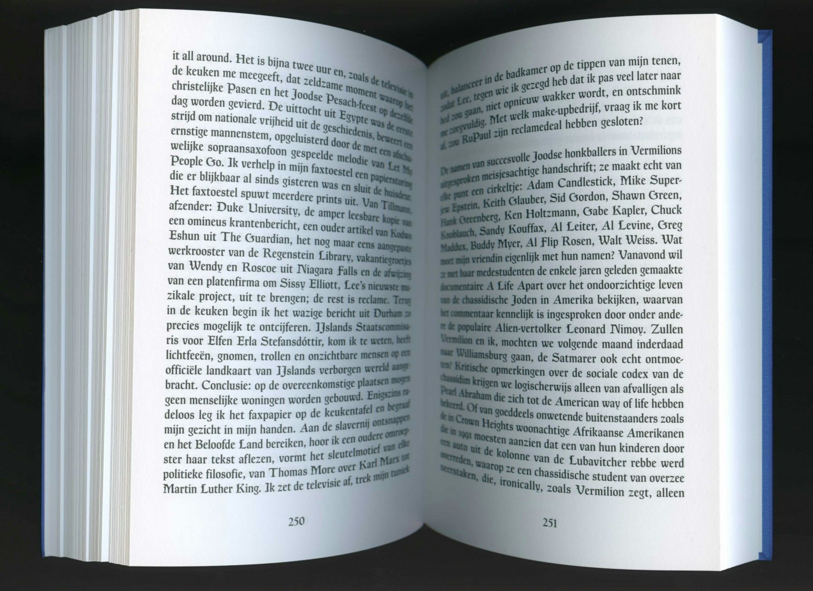
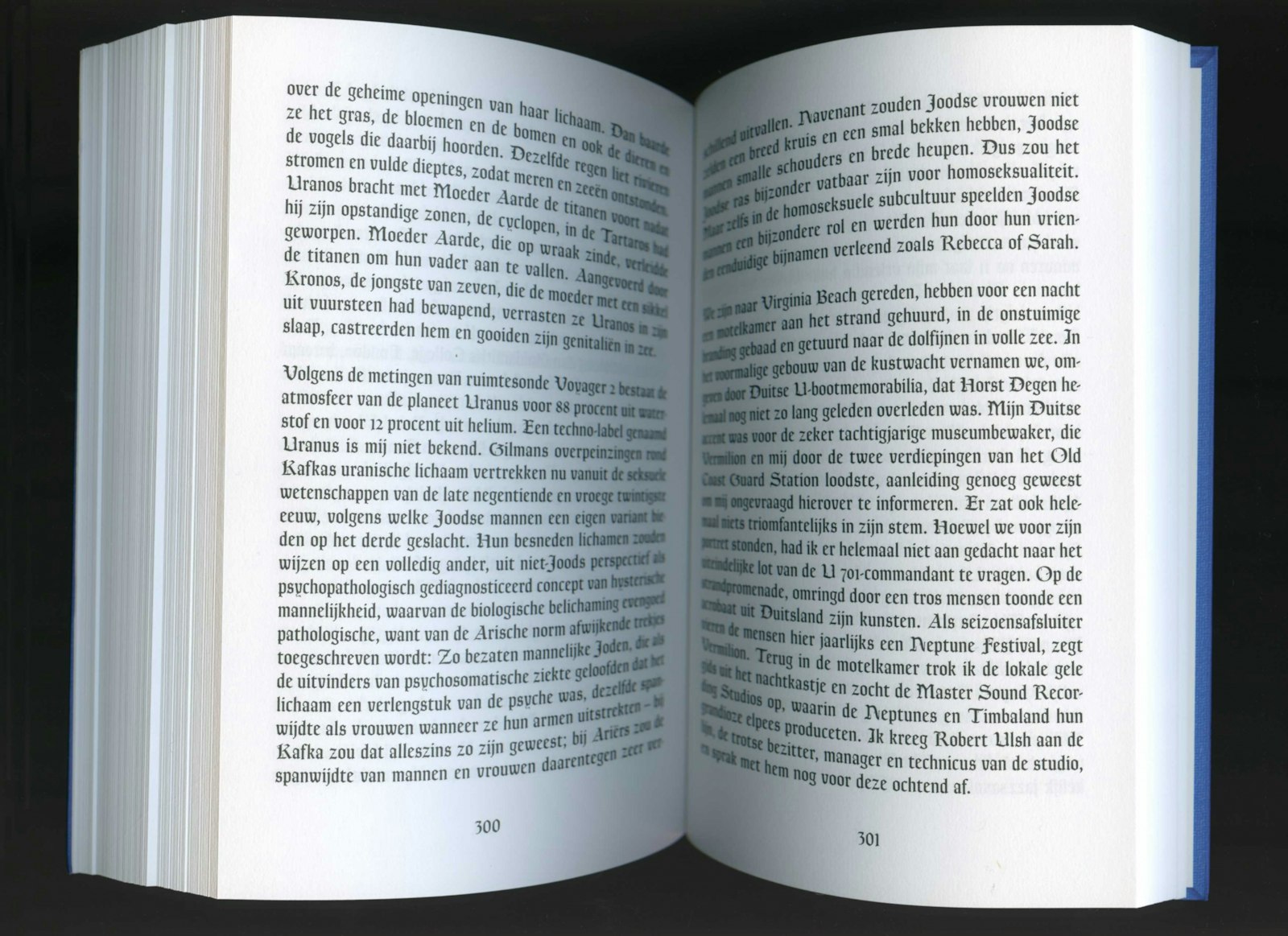
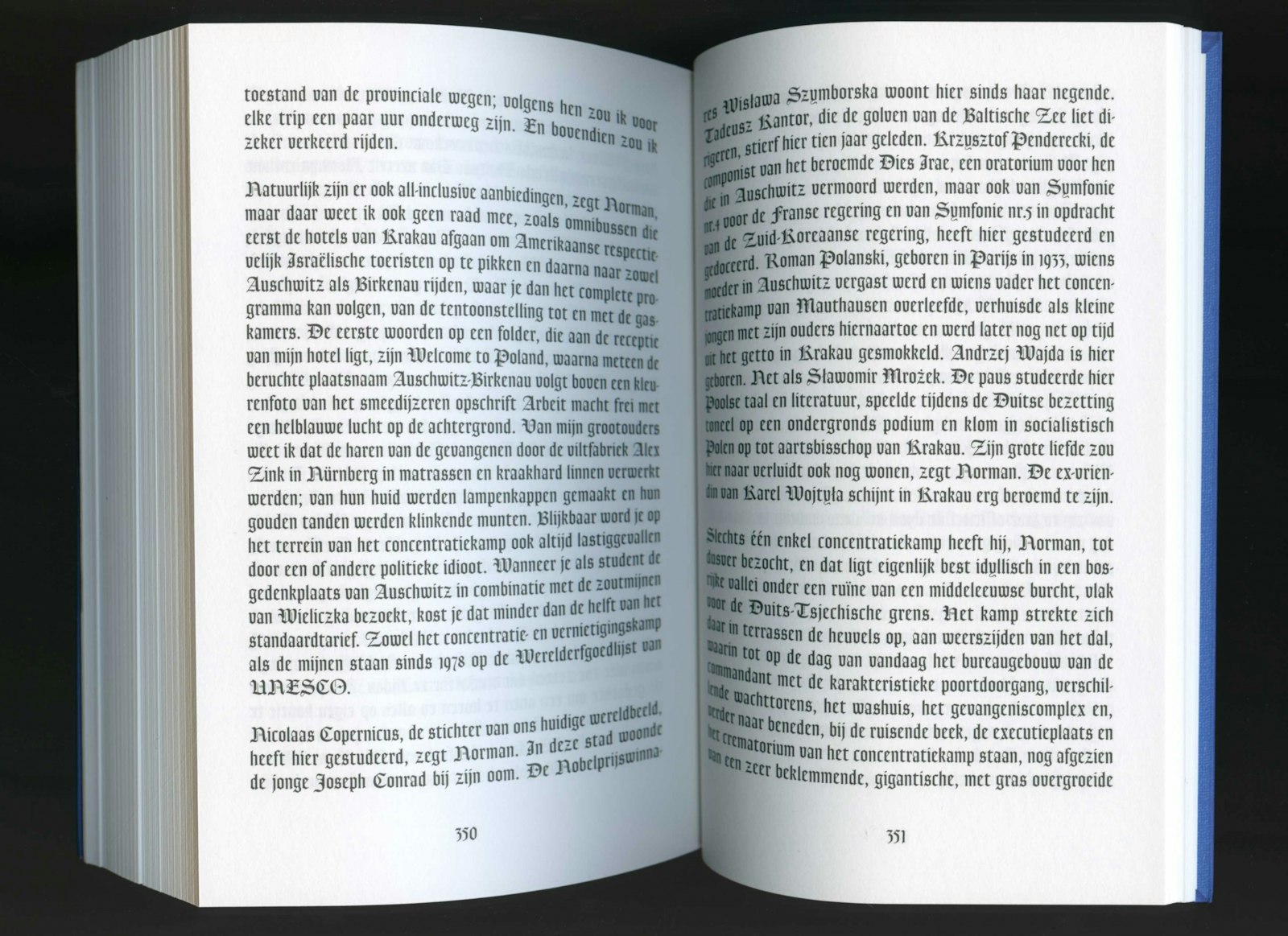
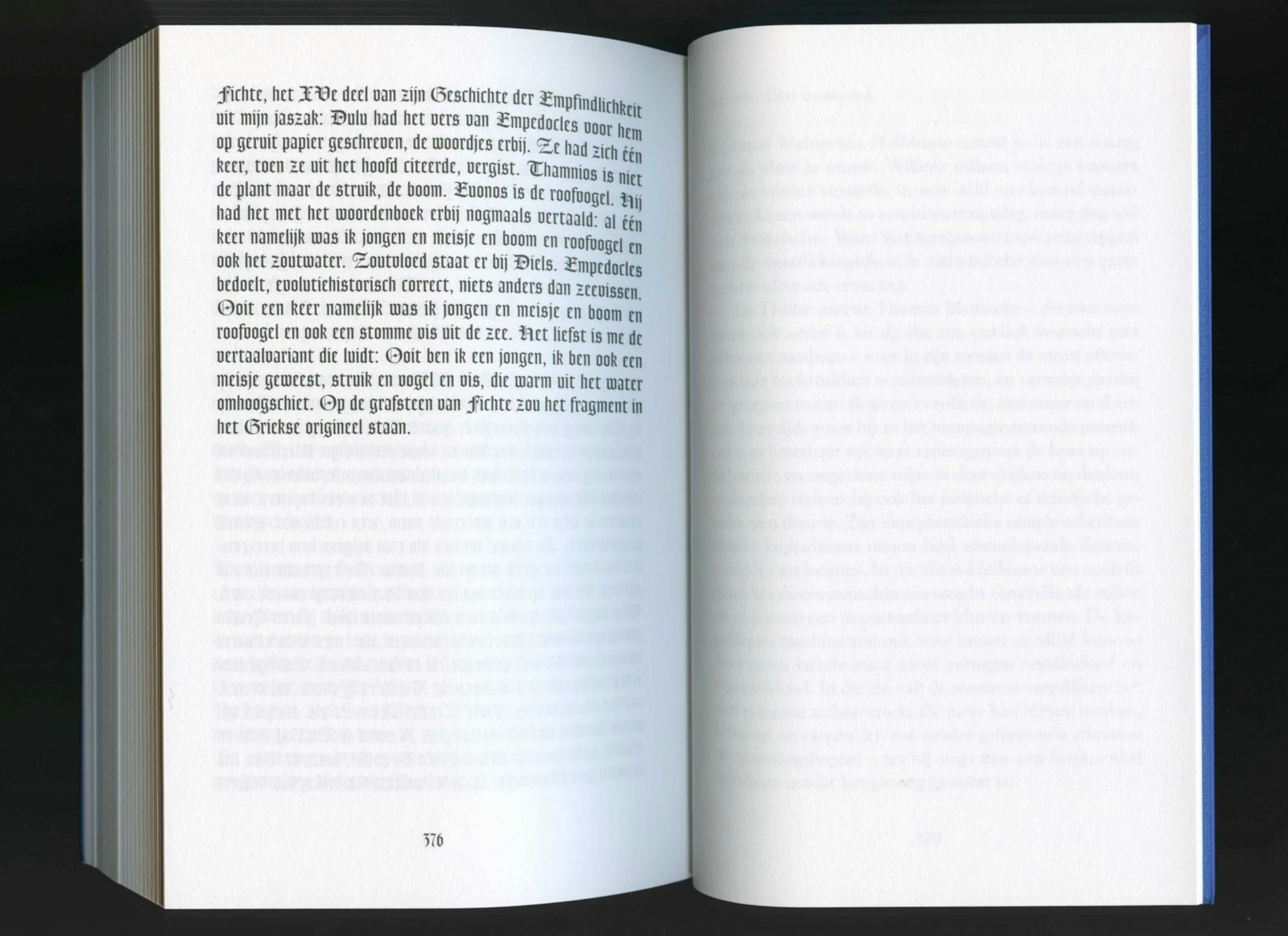
Eva Moulaert of Dear Reader, developed the transforming font Goudy Transform. The book is published as a translation from the original Hellblau (2001) from the leading author Thomas Meinecke. In his novel he outlines the world wherein words as gender identity, national identity or etnic uniformity become completely fluid. In the dutch speaking edition the typography takes this concept of bastardization further: little by little the text transforms from a classic serif to a broken writing.
With this new translation, not only the important novel of Meinecke is spread but also new technological developments are used to visually emphasize political and social relevance of the story through typography. With this design Dear Reader, tried to intensify the content of the book. Graphic design should not be taken for granted. By accentuating language as material, they tried to offer another kind of reading experience. Language becomes more than its semantic meaning.

