de Velde
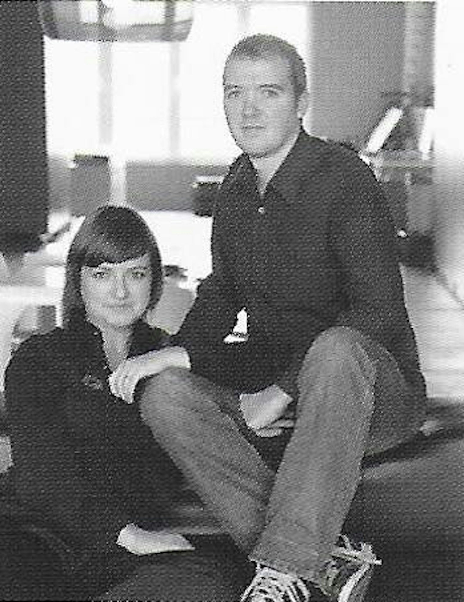
Tim Oeyen & Sanny Winters
It was above all the direct style of young graphic design duo Tim Oeyen (1971) and Sanny Winters (1975) that struck me years ago in their printed work for Galerie 't Eksternest in Rumbeke (1998).
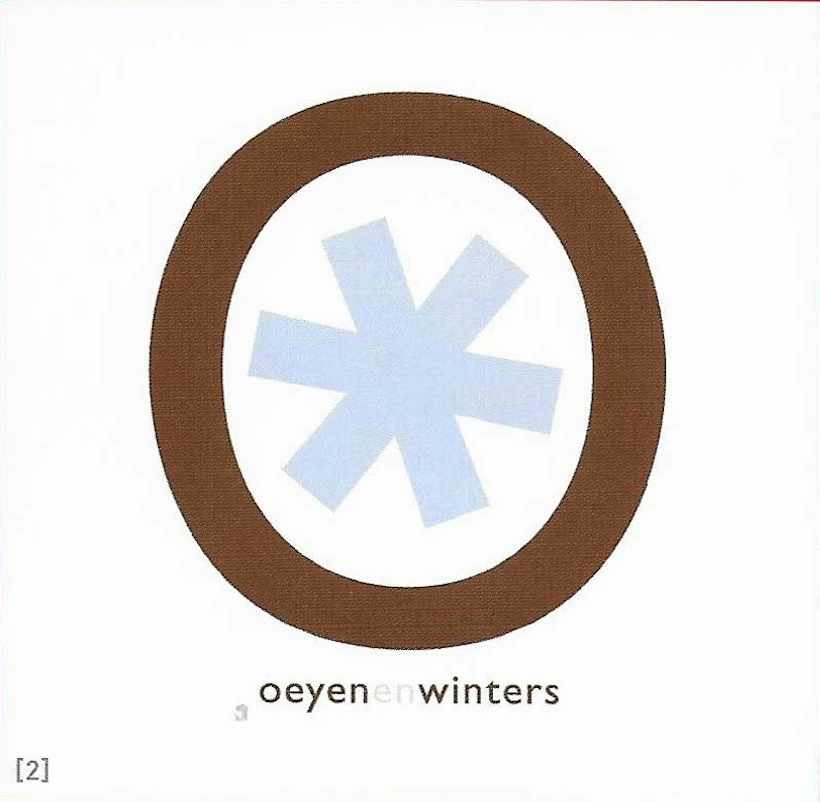
Letters become pictures
The strong, communicative images in crisp, clear colours leave a real impression. Their style has since matured, but is still clearly recognisable.
Tim and Sanny met at the St.-Lucas Hogeschool in Antwerp when studying Applied Graphic Design and Illustration. Despite outward differences in their work - Sanny working more with letters and Tim more with figures - they shared the same vision of graphic design. Both like to make their message very direct, while incorporating a touch of humour. They seemed destined to work together.
In their view, a graphic design should not just target a select group: it should appeal to a wide audience. This is why they opted for a pronounced style of a typographical nature, with a pallet of hard colours, flat elements, a touch of humour and positive naïvete. They let the whole grunge movement pass them by.
They are especially drawn to the Dadaistic movement, post-war pamphlets and posters and the work of Paul Rand (USA, 1914-1996), Neville Brody (GB, 1957), Dick Bruna (N, 1927), Gert Dooreman (B, 1958) and Anne Kurris (B, 1959).
Their global approach is one of surprise, attraction and accessibility. In a nutshell, they are all about direct communication, which they consider a must in any graphic design product. The overall picture serves to catch the eye, while the details are for the more attentive.
The details are what give them their light, humorous touch. The brochure Hasselt, de gezelligste stad in Vlaanderen, in which they play repetitively with the first two letters of the city on the cover, forming the word 'ha ha', is a perfect example of this.
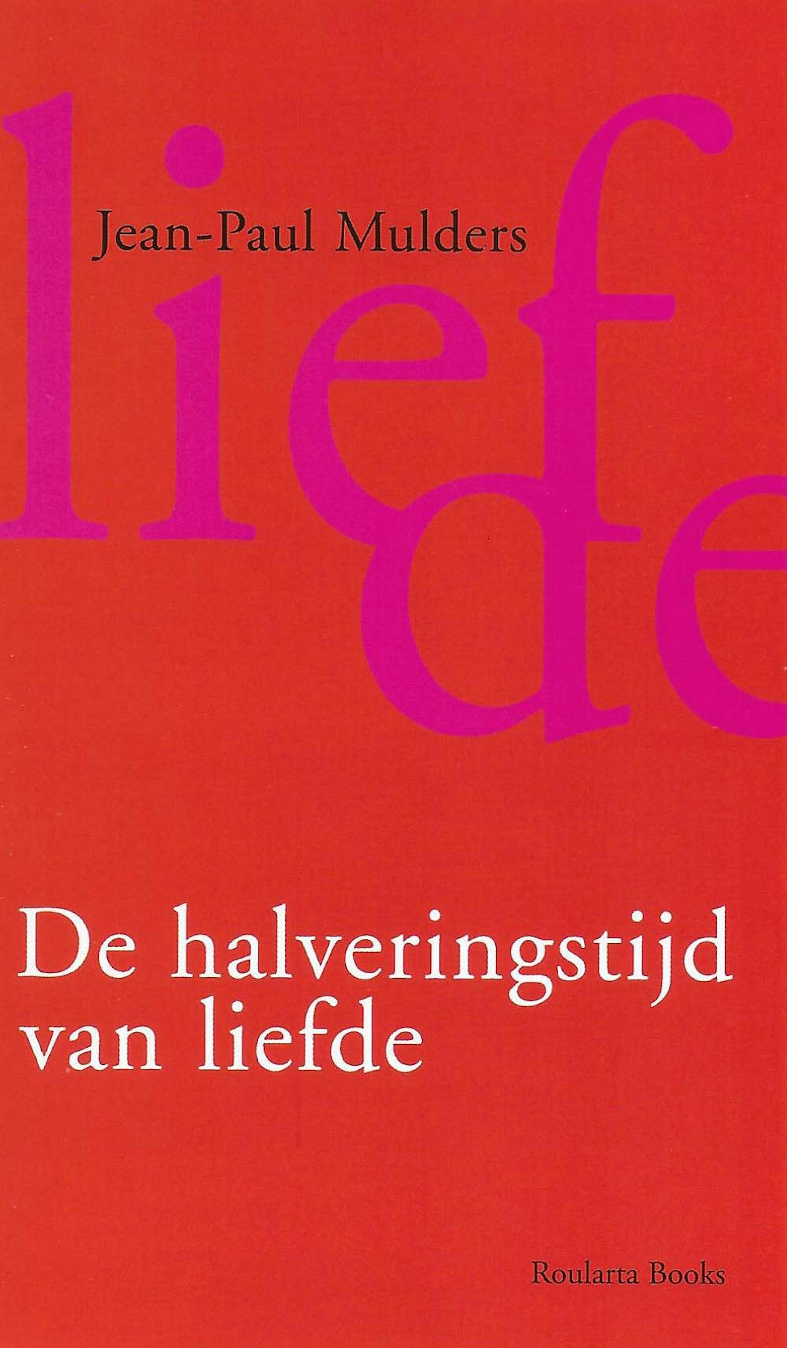
Their work could easily be classified as typographic. They do not design new fonts, but rather use fonts that were designed far before their time (Helvetica, Times New Roman, Garamond, Gill sans MT, Bauer Badoni). And they use these letters to make pictures. Letter pictures that reflect a clear message. The typographic character of Sanny's old style combines harmoniously with Tim's illustrative and systematic approach.
They always make sure that no one system dominates and that the design is perceived as a whole.
The simplicity of their style makes their work seem easy, but they actually do a lot of intense brainstorming and research. Sanny and Tim start their work by hand. They only use the computer at a later stage. They start by sifting through magazines, making collages, sketching, thinking critically and, most importantly, discussing. That is how an idea is born.
Their jobs initially originated exclusively from the cultural sector. During the Cultuurmarkt in Antwerpen (1997) they approached vzw Verschillig (Antwerp) and were given carte blanche to design 5 theme issues of the literary magazine Sampel.
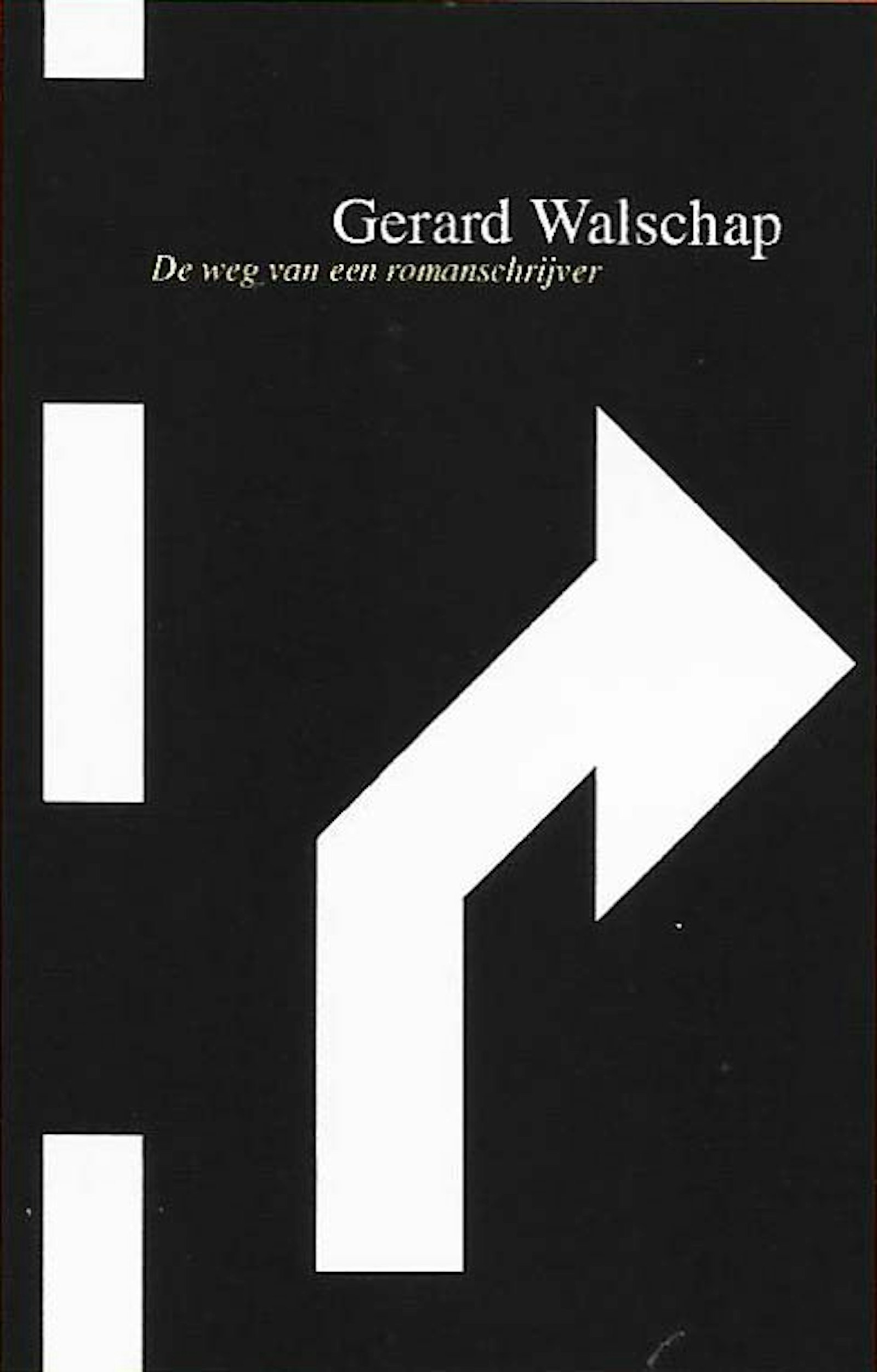
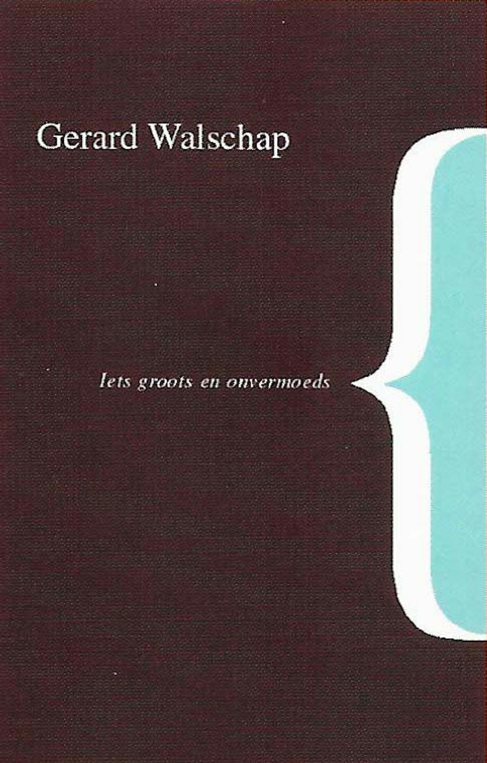
Cooperation with the former Head Publisher Harold Polis ended up with them doing the graphic design for a series of previously unpublished stories by Gerard Walschap. These were five traditionally published books with modern jackets.
Fernand Callebert of Galerie 't Eksternest was immediately drawn to their work and contacted them to ask them to design their invitations and posters.
Next came the Design Department of VIZO (now Design Vlaanderen), for whom they prepared the layout for an issue of Kwintessens (1999), the print work for the exhibitions in the Gallery (for their full schedule of programmes in 2000) and the catalogue for the Henry van de Velde Awards 2000. A series of smaller jobs followed. Starting in 2000, they designed the corporate style, from logo to letterhead, from catalogue to website to greeting cards, for designer ldir Mecibah (1958-2003).
Their work for Weekend Knack made it possible for them to choose other projects selectively.
Chief Editor Pol Moyaert was on the same wavelength and encouraged their interest in other projects. Initially they worked together on a freelance basis doing fashion specials (1999). In 2000 Tim became Art Director. After a short break from all their hard work, last year Director Tessa Vermeiren and Chief Editor Trui Moerkerke asked them to restyle Weekend Knack entirely. Knack weekly was next. Tim became Art Director once again on a freelance basis.
Both of them were disappointed with the distinction drawn at school between graphic design and publicity, between the artistic and the more commercial. They also see projects from the commercial sector as a major challenge (such as the communication campaigns in 2002-2004 for Cocoon, lnWonen and Art Brussels fairs). Many of their projects began small, but got such rave reviews from their customers that they ended up designing those customers' entire corporate style. Fernand David had hired them just to design the menu for the Scandinavian restaurant Smør in Brussels. This menu already drew one's eye. But Tim and Sanny prefer to start from scratch so they showed him their portfolio. It turned out that this one project evolved and they ended up setting a new corporate style, from the logo to even the uniforms and a say in the interior design. Now they are doing this all over again for him for the new Casino Kursaal in Oostende.
Some people give them carte blanche for their projects; others have more trouble following their train of thought. While they continue to find their jobs challenging, they long to design freely outside the context of an assignment.


![André Verroken. Affiche voor zijn tentoonstelling in de Galerie van het VIZO [2000]](https://www.datocms-assets.com/53750/1631526086-2004oeyen-winters-verroken-affiche.jpg?w=1600&fm=jpg)
!['13 Antwerpse musea. Anders bekeken' [2004]](https://www.datocms-assets.com/53750/1631526090-2004oeyen-winters-musea.jpg?w=1600&fm=jpg)
![Restaurant Smør [Brussel]. Interieur. © Michel Vaerewijck](https://www.datocms-assets.com/53750/1631526083-2004oeyen-winters-smor.jpg?w=1600&fm=jpg)