de Velde
Waters
Waters is a book created to mark the events of the North Sea flood of 1953.
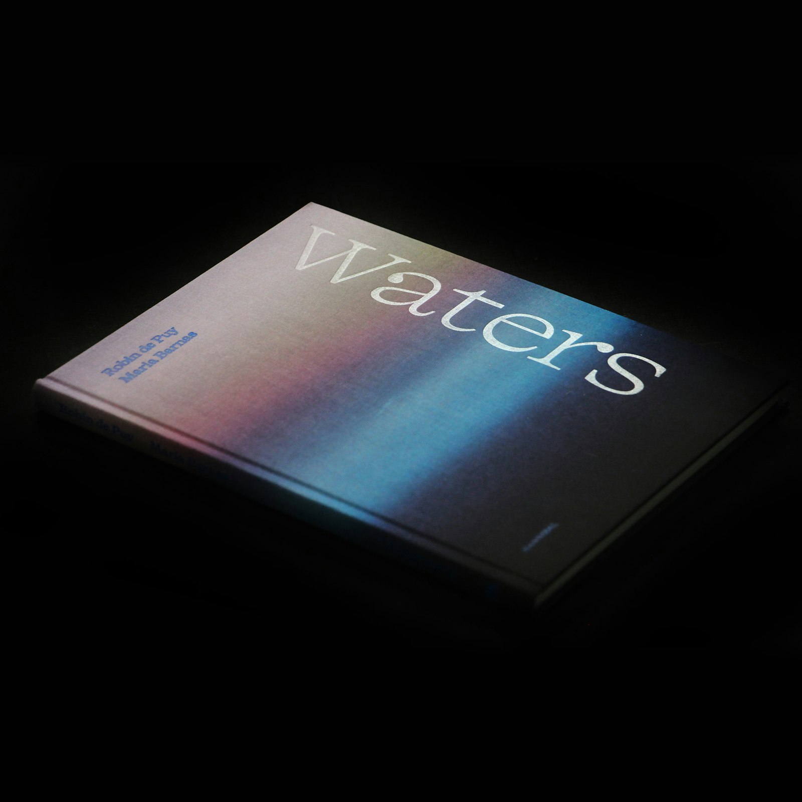
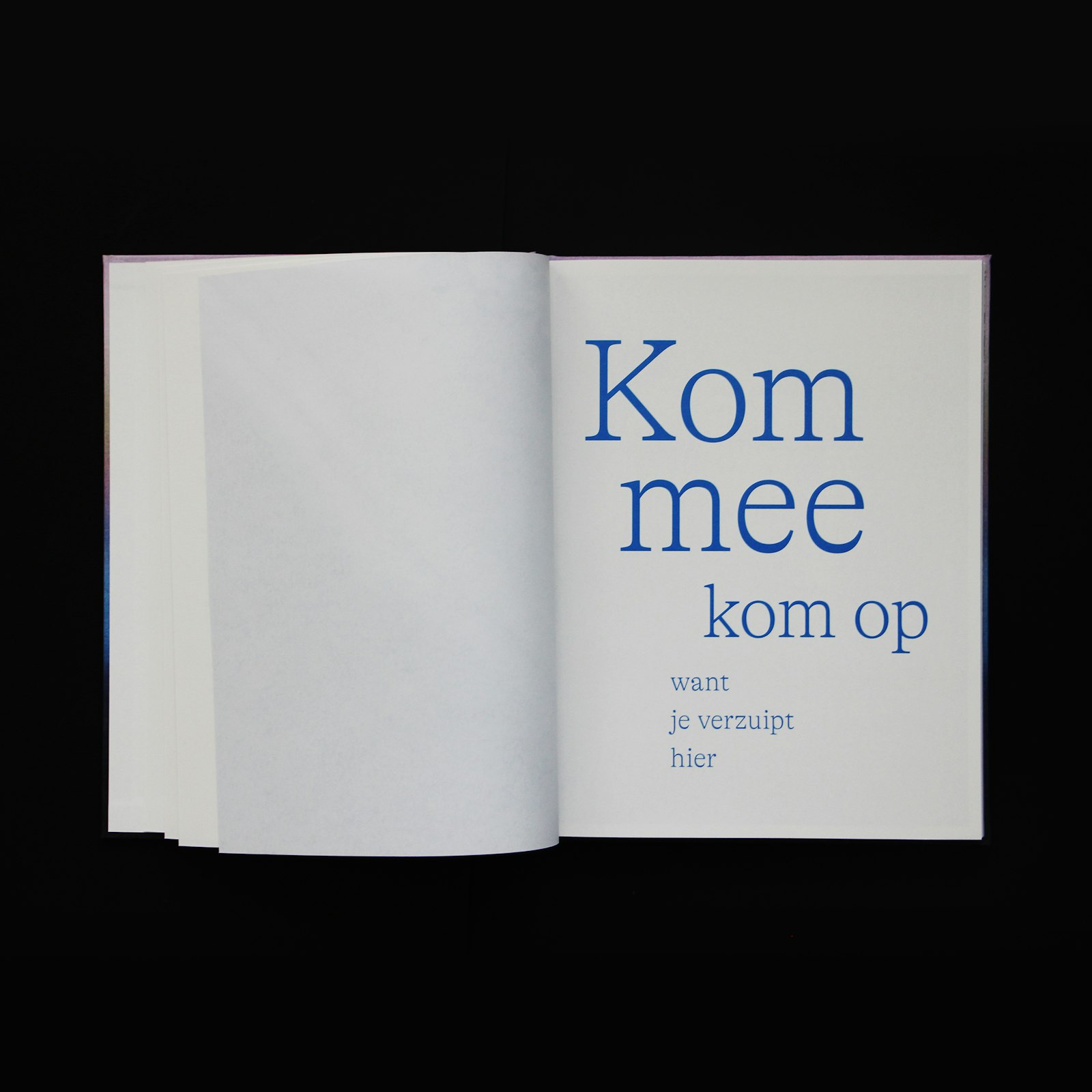
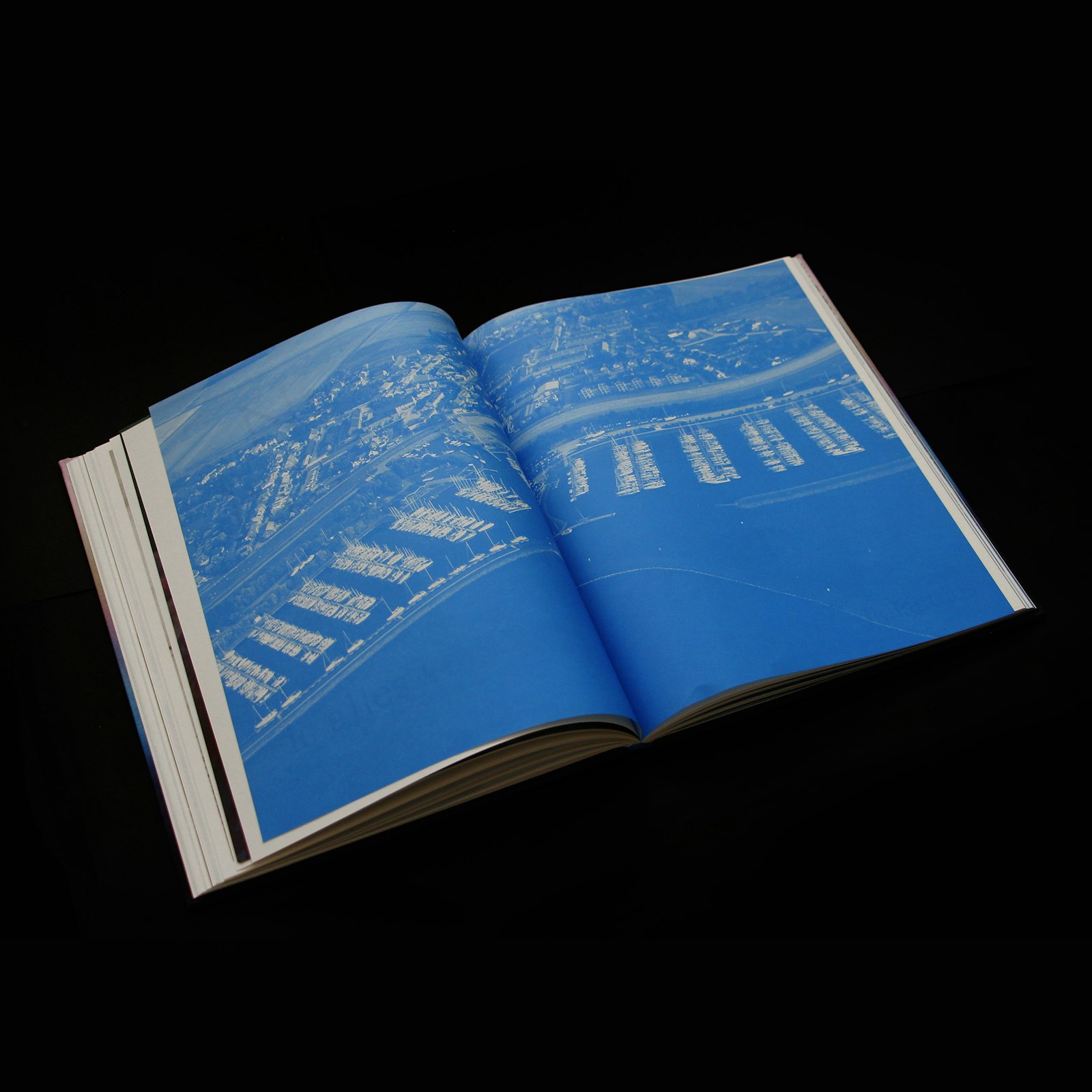
The book Waters commemorates the flood disaster of 1953 in the Netherlands through memorable photographs by Robin de Puy and poetic snippets of text by Maria Barnas. The cover, wrapped in a linen fabric with an abstract colour gradient, shows the threat of rising water. The title, printed in transparent foil, is recessed into the image and is only visible if you hold the book against the light, like the reflection on the surface of water. The interior is printed on soft, uncoated paper, nicely matching the warmth and humanity of the stories. The aerial images are displayed on a thinner, almost translucent matt paper and printed in a monotone blue.
The jury on Waters:
A compelling book with a striking relationship between image and text, typography and photography. A very accessible and low-threshold form that has been developed for a difficult subject. A poetic approach to a very emotional theme. Not a design that seeks attention with a lot of spectacle, but one that grips the reader in a pure and sensitive way.
What does this award mean to you?
Obviously, an award is very nice because it’s recognition for your work. It’s certainly a source of motivation to continue striving for beautiful books, but I particularly like the fact that the jury chose a book project. Despite the rise of digital media and e-books, the printed book has made an impressive comeback and remains a popular medium. The feeling of paper between your fingers, the turning of the pages and the smell of ink all contribute to the pleasure of reading. And that is precisely what we, as designers, can contribute to. A book should not only be a source of knowledge, but also an artwork in itself. I think, increasingly, people are also appreciating the beauty and craftsmanship that comes with making a book.
How did the idea for this project come about?
The design naturally comes from the theme of the book. The form of the book was intended to reflect the experience, memories and emotions of the people portrayed. For the cover, I suggested a linen fabric, on which an abstract colour gradient was printed. That image shows the threat of rising water. The cover deliberately doesn’t show swirling waves or devastating storm scenes, but a serene image that fits the tributes and the commemoration of the terrible disaster. The choice of this tactile paper fits in nicely with the warmth and humanity of the stories.
What makes your project so special?
Although this is a historic commemoration, this book remains very topical. Climate problems are piling up. It seems obvious to me, then, that as a designer you are going to think about how to minimise or eliminate the ecological footprint of a book. This can be done, for example, through the choice of paper. Munken was used here, for instance: a beautiful paper that is also high sustainable. The wood used for the paper comes from Sweden and is harvested locally. Government measures are increasing afforestation in Sweden, which means that the paper harvesting does not have a negative impact on the environment. As a designer, I have also chosen to have this publication printed at a sustainable company, using environmentally friendly inks that are also suitable for recycling.


