de Velde
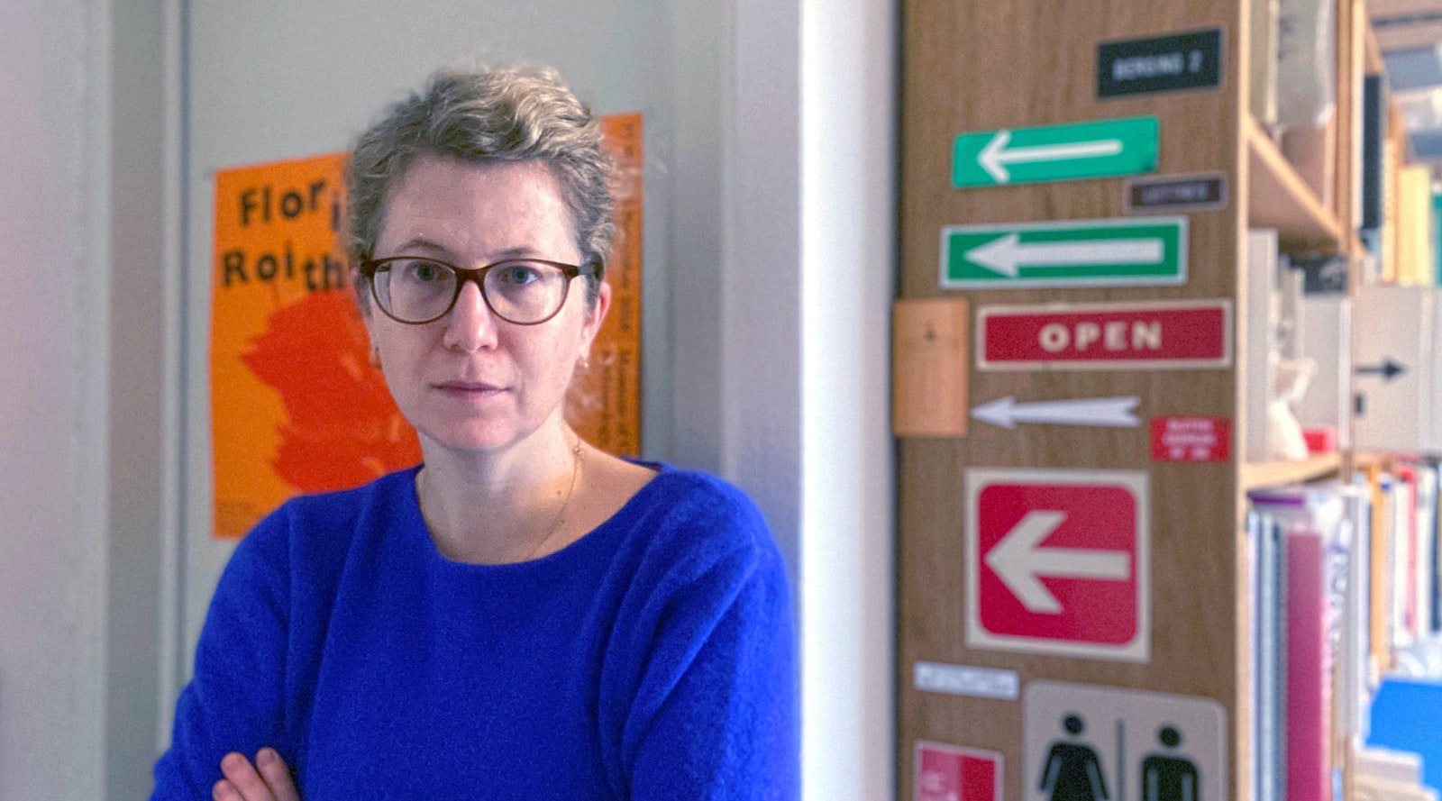
Sara De Bondt
Sara De Bondt occupies an unassailable position in the cultural domain as a graphic designer.
She works from her base in London for clients across the length and breadth of Europe, and not just any clients: the V&A Museum, the Barbican Art Gallery, the Tate and BOZAR to name but a few. She employs two people in her studio and has already prepared a string of trainees to be designers. In addition to this she has given countless guest lectures, taught for a while at the Royal College of Art and currently teaches at the KASK in Ghent. She organises conferences and runs a publishing house for affordable art books. Indeed, her ambitions seem to stretch out endlessly and from her impressive CV you would be forgiven for thinking that we are giving Sara De Bondt a lifetime achievement award. No. For the time being she will have to make do with a Henry van de Velde Award for Young Talent. But if you thought that award had been a long time coming, you wouldn’t be wrong.
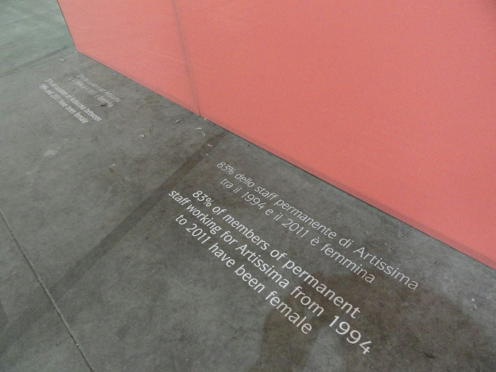
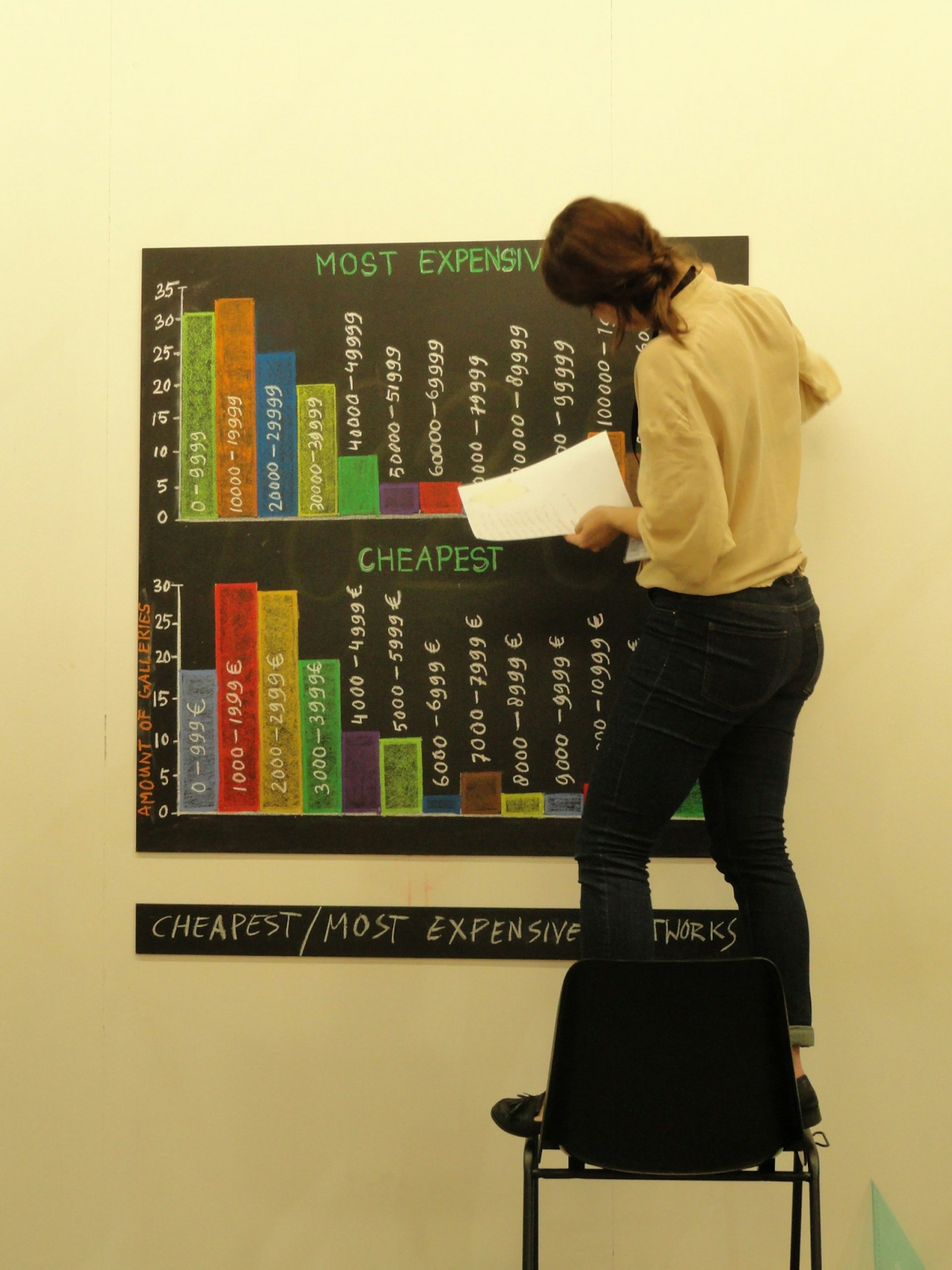
Normally a piece like this would open with a chronological overview, starting with the laureate’s studies. But you can find out more on that subject in the many places where she has already been written about, or the 2010 Canvas documentary on her. Perhaps we should just start with the here and now. Her most recent project was the communication campaign for the Italian art fair Artissima. Since it is hard to encapsulate the diversity of modern art in a single image, Sara came up with an ingenious solution: she suggested using infographics – visual representations of statistical data.
Every item of content was the result of a small survey. On one occasion the data even led to sociologically relevant insights, such as a comparison of the numbers of female and male artists. On another occasion, they revealed the mundane reality behind such a high-profile event, as in the number of oversized packages or poster tubes that were delivered. Sara is enthusiastic about the concept, but admits that the amount of work it involved snowballed. Nothing was too much effort. During the fair the entire Sara De Bondt Studio actually moved to Turin to set up – on the trade fair floor – their own ‘office of statistics’, where new statistics were generated live. She took the concept all the way: around her own stand there were all kinds of colourful bar charts on perspex panels, and pie charts chalked on blackboards were being constantly updated. Fate played a hand here and there: the glass façade of the trade hall looks something like a set of Cartesian axes waiting to have a graph drawn on them. The infographics were the binding agent that brought the visual identity of Artissima together. This is graphic design that creates itself, or just about.
The Artissima concept illustrates Sara De Bondt’s design outlook, which you could describe as a sort of ‘ecological awareness’. You can take that literally, because she is forever exploring environmentally friendly alternatives in the printing process, but interpret it broadly too: she likes to steer clear of the unnecessary in her projects. In an oversaturated information society such as ours communication that doesn’t actually add anything is, by definition, wasteful. She doesn’t like to think of graphic design as an arbitrary form, a necessary part of an otherwise pointless marketing strategy. Ideally, the form is more than a vehicle for the message and is actually (part of) the message itself. ‘The medium is the message’, but in a good way.
In setting out to uncover that added value she tries wherever possible to question the things we normally take for granted. In 2006, for the arts centre Wiels, for example, she had designed a visual identity that exploited to the full the long-established elements of colour, logo and typeface. Everything that followed was a reaction against it: “I think that that visual identity still works really well for Wiels, but what do you do afterwards, when you have done something already? You yourself try to evolve too, in your work... For Nottingham Contemporary we built an actual exhibition around the search for a logo. They ask every artist who comes there to design them a logo. Admittedly, artists like to be a little contrary at times and some of the logos may not be very useful, but that’s what actually makes it so interesting!” To give the ‘permanent collection’ of logos a sort of unifying theme, however, they always use the same typeface. Together with Jo De Baerdemaeker they went in search of a typeface that had a firm link with Nottingham. In the St Bride Library they came across books that were produced by a 1930s Nottingham printing school, in which the same typeface always appeared: Elegant Grotesk. They made a new digital version of this font.
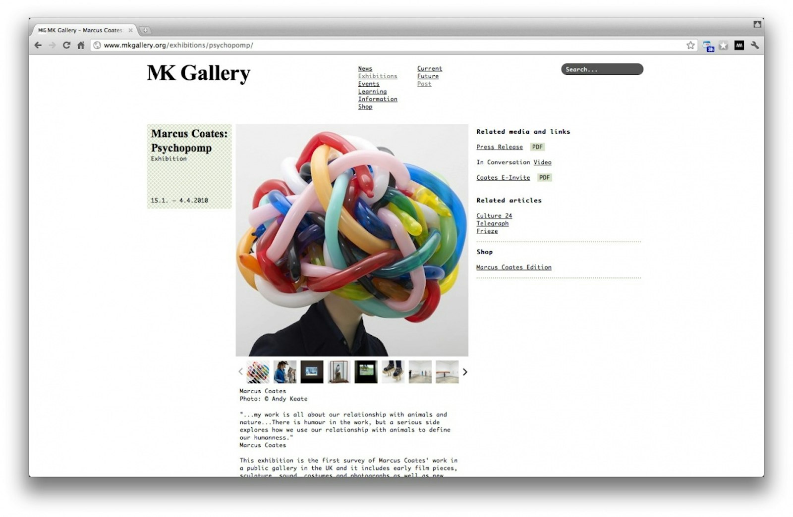
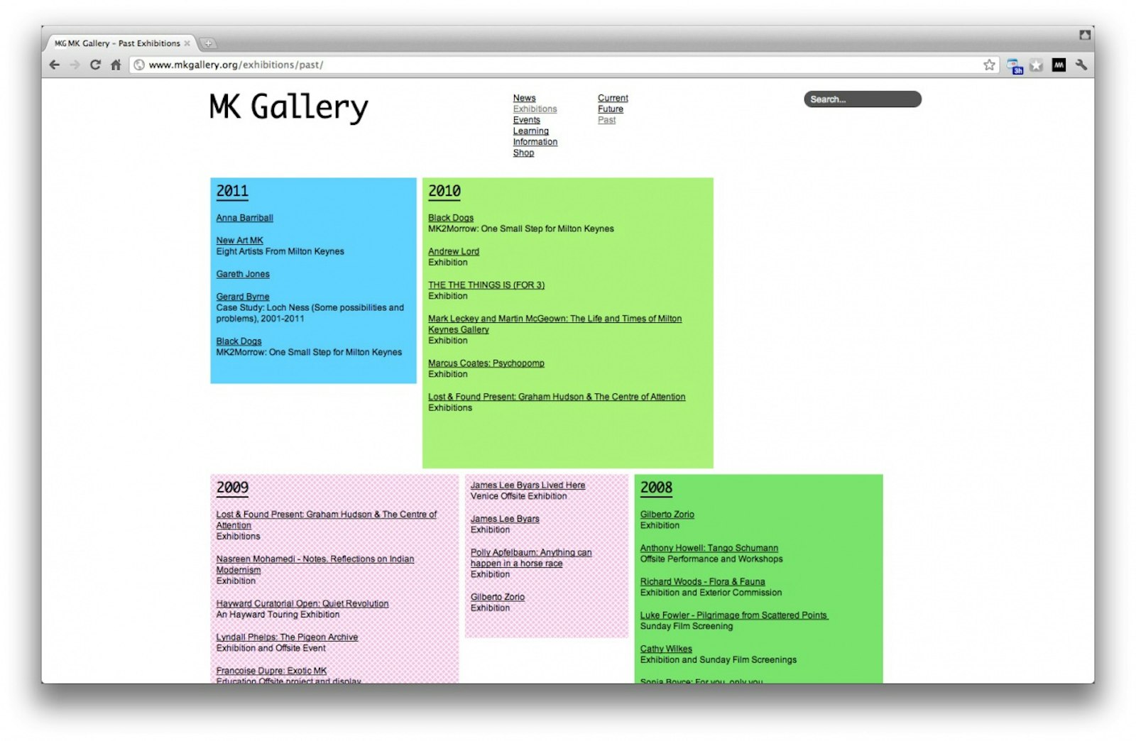
Though Sara De Bondt does love to see flexibility in an identity programme, she drew a very radical line through the concept of ‘visual identity’ in a recent assignment. Instead of coming up with an expensive manual full of impeccable instructions that everyone would eventually make fun of anyway, she sought to reduce as much as possible: for the MK Gallery in Milton Keynes she dispensed not only with a logo, but with a predefined colour scheme and exclusive font too. Staff can choose between six of the standard fonts available on any computer: “Anyone can design the logo. The actual identity lies in the placement of graphic elements on a grid. This is a reference to Milton Keynes, a town that was conceived on a grid. The building itself is almost a cube. On the website we use alternating colours that always refer to the art works themselves. This prevents the gallery’s identity from breaking loose from what it does, from what it offers.” This is yet another nice example of Sara’s ecological design principle: by reducing the number of rules, space is created for content.
Sara De Bondt doesn’t rely on images to show off her work. She prefers to show the tangible output of her work, the printed volumes themselves. And rightly so, because her creations are precious things. That doesn’t mean that they look expensive or chic, but that they feel as though they are made with great dedication and complete abandonment to the task. They are well thought-out, genuine, effective and ‘finished’: nothing is left to chance, although their appearance can sometimes come across as obvious or playful. Her creations are timeless, even if their message is limited in time. Who, for example, would be heartless enough to bin a newsletter from the British Council if it had been drawn entirely by hand, including all the running text and photos?
Sara De Bondt’s projects reveal an ongoing pursuit of added value. The execution itself has to follow the underlying idea, even if that means exploring the limits of what is technically possible. She doesn’t see that as being too much of a problem, because her innate curiosity can turn just as easily to the more practical side of the profession. When star author Jonathan Safran Foer wanted to cut entire passages from a book to create a new novel, the printers told him it couldn’t be done. Sara took this challenge on. It was eventually to become a titanic work of trial and error, but she enjoyed every single step of the process.
In all the diversity of Sara’s portfolio it is hard to find a ‘style’. At most we can tease out a few recurring elements, such as the use of bright colours. Designing with a vast colour pallet often means running the risk of tastelessness, a challenge from which many of her fellow designers would prefer to shrink. But Sara De Bondt proves that colour still has a place in a contemporary visual grammar.
Sara wants to make sure that she doesn’t slip into a particular style and so she is always open to different ideas and influences. This explains her many collaborations over the years. Indeed, she doesn’t actually believe in the myth of the individual as a creative genius. But her urge for innovation also has much to do with her vision of the profession itself: “I don’t see graphic design as something that revolves around a visual ‘imprint’, the stamp of the designer, but around ideas. How an idea will eventually look depends on the assignment, the client and the context. And I don’t want to end up repeating myself, because I’ll stop learning. For example, there was a time when I designed lots of art books, but started feeling that I wasn’t making enough progress. After a while you get to know the tricks of the trade and it is like flying on autopilot.” Her aversion to the very latest trends and her fear of repeating herself are deeply engrained: “Clients often approach me because they have seen something in my work and would like something similar. For example Kunsthal Charlottenborg in Copenhagen had seen my work for Wiels, with all those vivid colours. I did a project for them that involved lots of black!” [Laughs]
Rather than a style, she allows her projects to be guided by a way of doing things, an approach. That approach tends to centre on the development of a strong concept, and that can mean that it is not always easy to find clients: “The fact that I babble so much about things, that I question everything, might scare a few clients off. I sometimes notice that other agencies win pitches because they simply do what is asked of them.” This doesn’t mean that Sara is hard work, or an ‘awkward customer’. On the contrary. Her critical disposition simply means that she likes to seek with an open mind the untapped potential of an assignment. She likes to think along with the client so that he gets all he can from the interaction.
Sara thinks that the preliminary phase of playing with ideas is necessary, but she also enjoys the execution. It is nonsense, she thinks, to try to separate an idea from the mould in which it is cast. This is why she soon quit her first job in London. Everything revolved around ideas at Daniel Eatock’s, but she was only allowed – the poor girl – to use the one typeface. Coincidentally she then met James Goggin and they decided to share the work. This enabled Sara to start up on her own in London. She admits that the allure of her base of operations may well have helped her find clients, but she is not overly enthusiastic about the London design scene: it is all better organised there, but, at the same time, it is more regulated and ‘smoother’. She often has to deal with marketing departments that expect her to mindlessly carry out what she is told to do. We can only conclude that things aren’t quite so bad in our own cultural sector: “In Belgium, for example, you as the designer have direct contact with a curator and there is no marketing department in between. Here, we still have the sort of mentality that allows us to work through something in dialogue. My best clients are without doubt the Belgians. Practical considerations aside, the best thing I could do is move back to Flanders.” That’s what we like to hear.
Sara De Bondt is at once designer, lecturer, researcher, business manager, accountant, publisher, editor, curator and conference organiser. That’s quite something. She spent the last months of 2011 in an artists’ residence in Stockholm. She was able to relax there and think a bit about where she wants to go. She has worked, among other things, on a historiography of graphic design. The book will be published by Occasional Papers, a publisher of good quality but affordable art books which she set up with her husband. She thinks it important that people reflect on and write about design processes and subjects and that designers share their experiences with each other. For her, it is a subject of continual self-study and a way of filling in the gaps in her education. In the future she would even like to write a history of Belgian graphic design. She just has to find the time...

